De-risking a £300k project with a Design Sprint
This case study is for a real paying client at thestartupfactory.tech, but the names of the business and the people are changed for anonymity.
ClosedBox is a training and development consultancy, teaching "soft" skills to employees such as leadership, delegation, or critical thinking. A pair of work colleagues, one managed by the other, sought to productise part of their offering as a tech product.
After positive initial conversations, development had begun in earnst, but I quickly found the project struggling with a consistent direction and fact based decision making. What's more, the project was geared up to spend it's entire £300k budget before involving a single end user.
For me, that prompted the question:
HMW gain confidence in and influence our product direction and decision making, before spending the entire budget?
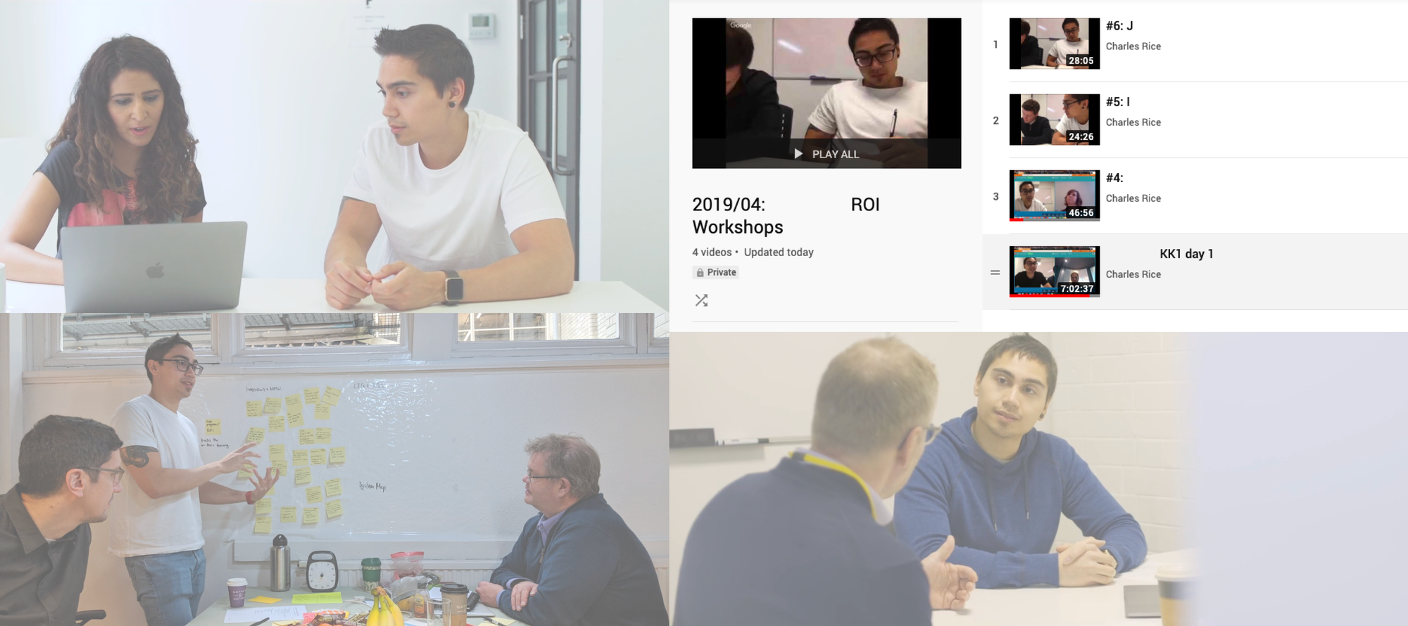
Overview
First an overview of the roles I assumed, the skills I used, and the team I assembled for the job.
Roles
- UX Consultant
Timeline
- 2 weeks
Skills and techniques
- Design Sprint
Approach
I arranged and performed a Design Sprint to:
- Engage key stakeholders
- Gain everyone’s understanding
- Make our thinking tangible
- Perform timeboxed interviews with users
Running Design Sprint 2.0
I used the Sprint 2.0 methodology from AJ&Smart. There were a few reasons I opted for a Design Sprint:
- Our target users had up to 14 hour work days; we needed to be efficient.
- We needed clarity as quickly as possible, to determine if we were digging a rabbit hole.
- Gathering buy-in was easier using a tried and tested methodology.
In addition, I made some some modifications for my use case.
Modification #1: Workshop format
Since the ClosedBox were based over 1 hour away, and the co-founders could only spend one day per week with us, I broke things down into a series of bite-sized workshops.
Modification #2: System modelling
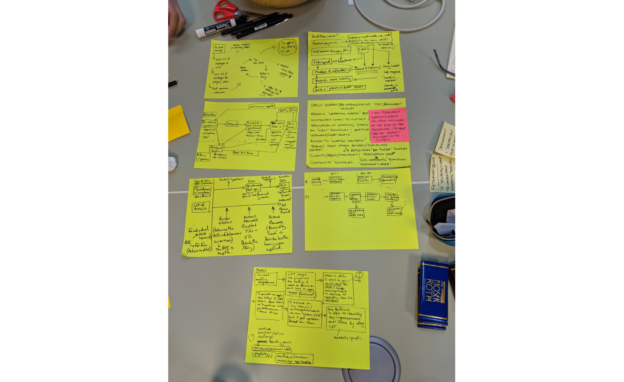
Everyone seemed to have different understandings. I asked everyone to draw how they understood the problem domain and share it amongst ourselves, before consolidating it into a single view. See ‘drawtoast.com’ for more.
Modification #3: Internal ideation
I made a judgement call to rely on the clients’ strengths and include them during idea selection, whilst educating my team further during ideation.
Modification #4: Note-taking delegation
In hindsight this was the most powerful. I convinced one of the co-founders to take notes during test day, resulting in them gaining a deeper appreciation for our target users.
Seeing is believing.
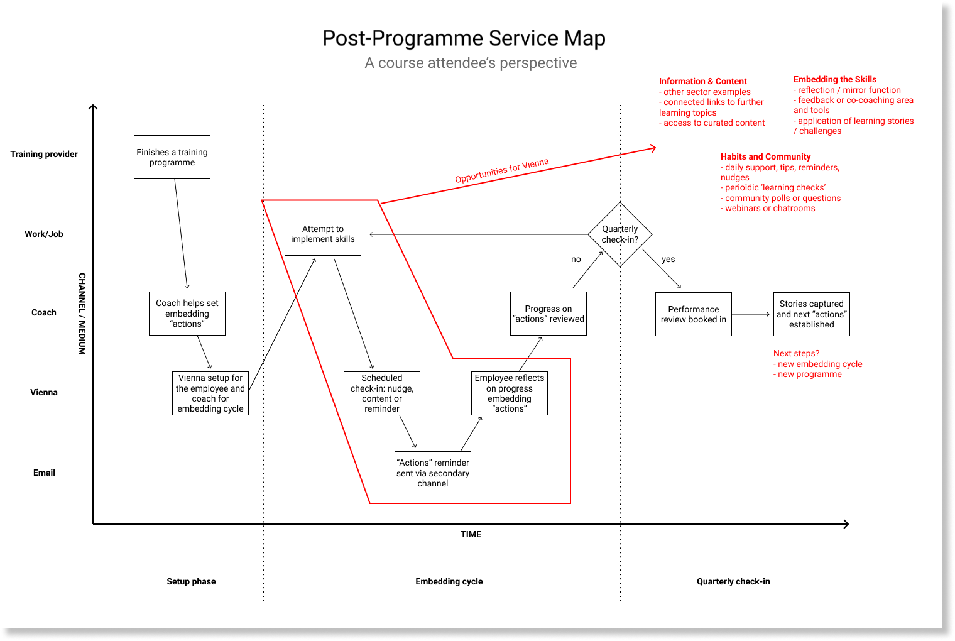
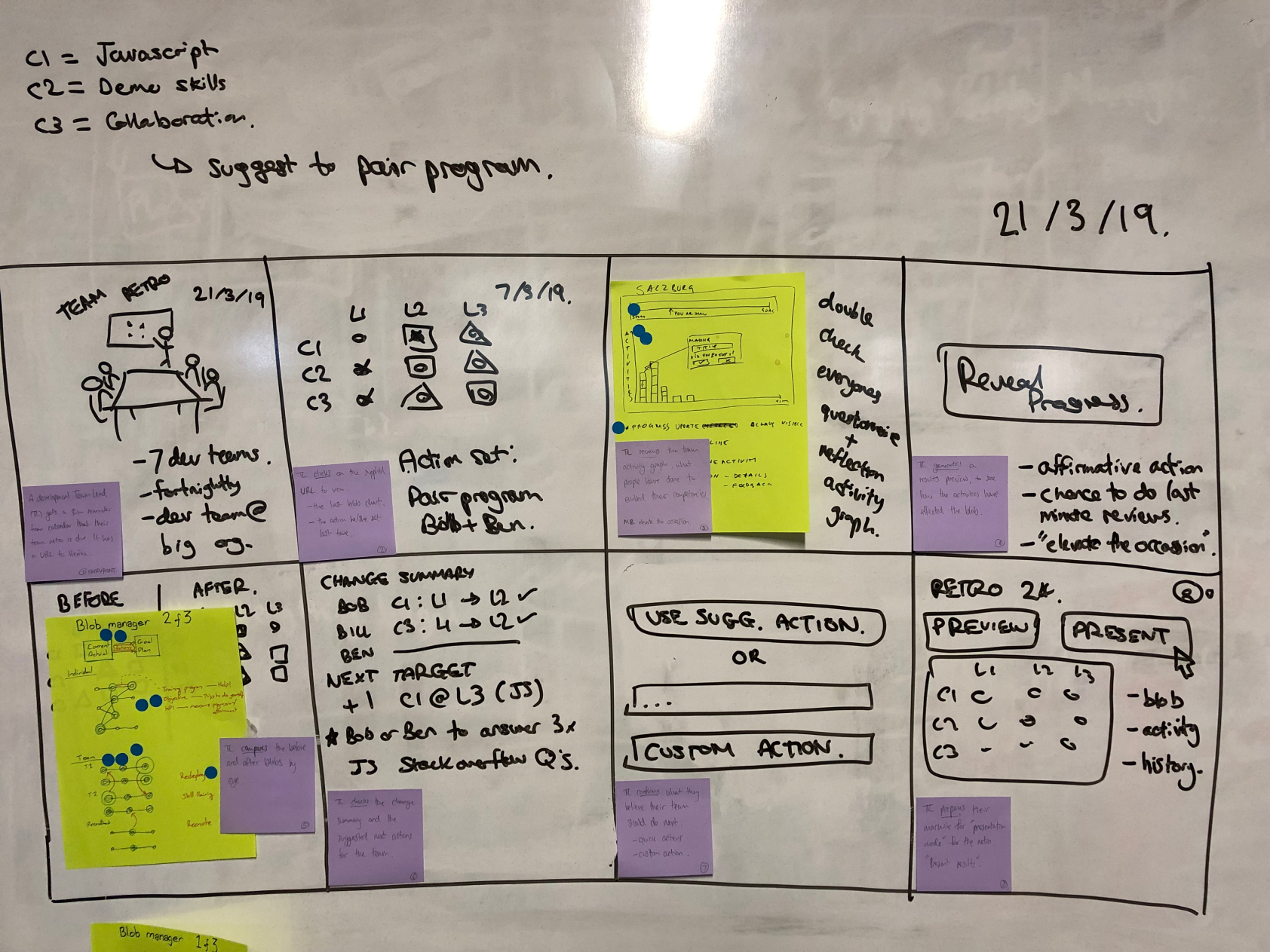
Challenges
I was only able to involve one of the co-founders directly in the user testing phase. Ultimately, they saw the need to pivot while the other co-founder did not.
A debrief is no substitute for experiencing the learning first hand.
Outcomes
After debriefing the client and our internal team we made a pivot of the project, and launched a pilot test at 50% of the budget spend. Previously this had been 90% or higher.
In addition, I found out one of the co-founders left some time afterwards, and a year later started their own version based off the learnings from our Design Sprint together.
At the end of the day, it's about calculated risks, and I wish them both success.
