Designing a financial input affecting multiple flows and design languages
at Residently • B2B • PropTech
During work on our B2B offering for property managers at Residently, it was clear that there was high friction when entering the Security Deposit and Holding deposit amounts. It was often rounded incorrectly when automated, users needed a calculator or spreadsheet to hand, or the amounts could be non-compliant.
In addition, the timeline here was tight—a couple of days to design 80% of the solution.
As an end-to-end design piece, I wanted to answer:
Can we improve input accuracy without sacrificing ownership of setting rental deposit amounts, in a low risk way?
Overview
First an overview of the roles I assumed, the skills I used, and the team involved.
Employer
Roles
- Lead UX Designer
Skills and techniques
- Content Design
- Interaction Design
- Wireframing
- Figma high-fidelity prototyping
- Design Systems
- Usability testing
- Questionnaire
Team
Whilst my primary role was as a Lead UX Designer to oversee our 3 squads, for this piece of work I embedded myself into the squad. Each squad takes a Lean UX approach, to discover and design one "slice" of a feature per sprint, ready for the next one.
This squad contained:
- A Product Manager
- A Technical Lead
- 4 Engineers
From our Discovery and Design horizontal, I received support and critique from 2 other Designers and 2 other Product Managers during "Design Critique" sessions.
Understanding the problem
First, a brief overview of how the concepts are modelled in the system, helps to understand the complexities involved:
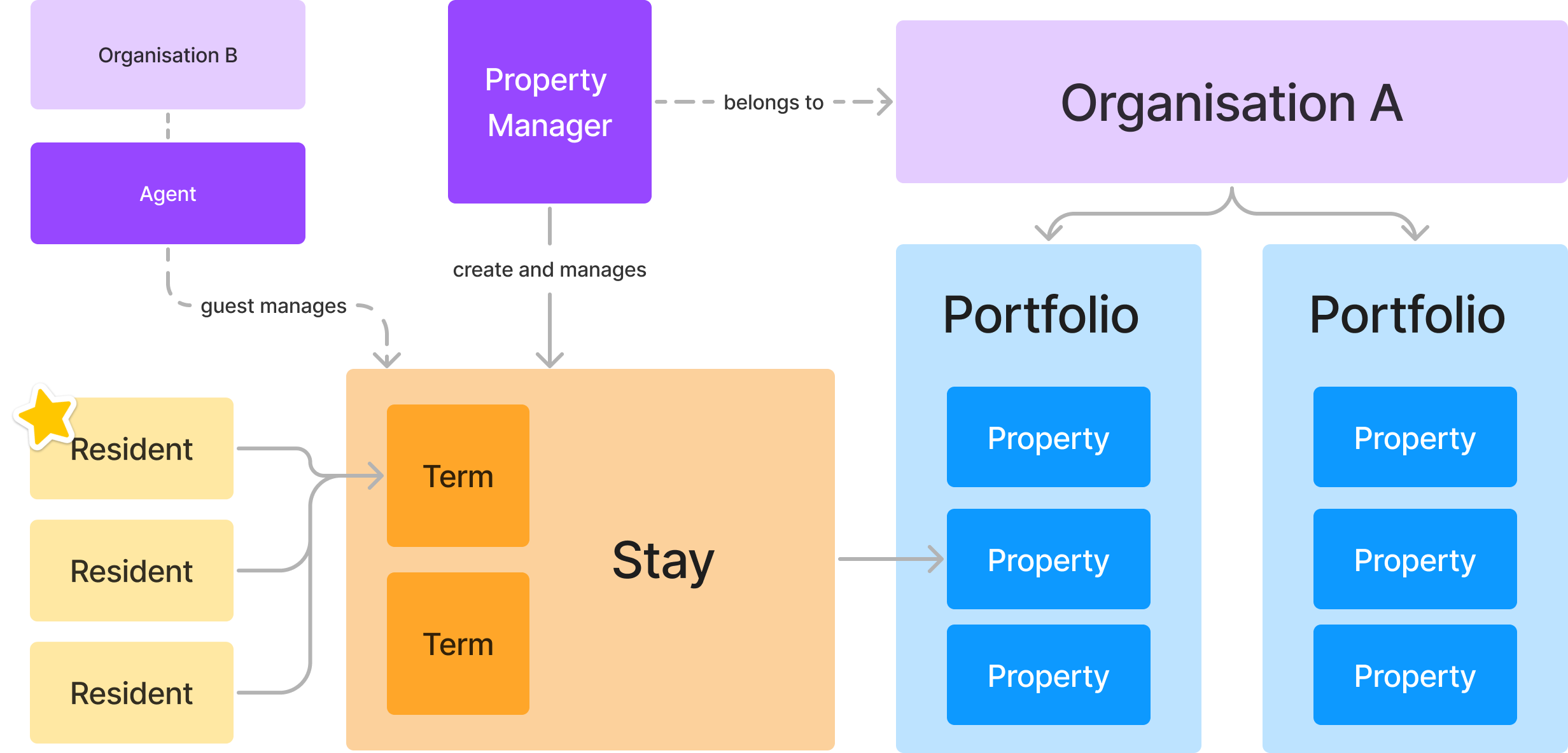
As for this specific case itself—the tenancies our partners were putting through our product, required four monetary amounts:
- the monthly rental value
- a security deposit
- a holding deposit
- total upfront rent
These amounts were used when tenants were invited to supply their details, pay their holding deposit, and displayed the first rental payment amount required before they could move in.
We previously calculated the latter two fields automatically for our partners, but we had frequent requests to our Engineering team to update or alter them. This was due to a few reasons:
- Different partners had different pro-rata calculations—for partial months you can calculate based off total annual rent divided by 365, or monthly rent divided by the number of days in that month.
- Some tenancies were calculated differently to the partner's "default"—for example one partner had branched to a new city and ran that portfolio differently, or a partial holding deposit had already been taken.
- The legal maximum security deposit could change depending on the rental value—it's 5 weeks rent for under £50k per annum, or 6 weeks if over.
Originally, this product issue was raised by one of our Product Managers. Data or evidence supporting this case came from our internal operations team. They kept a note of frequency of this request type, if it was due to mistakes, or due to rounding errors. It was high.
I had seen the spreadsheet myself, I'm in our #product-support Slack channel, and had fulfilled this request when I was a Tech Lead, so I'm confident this was a recurring high friction issue worth solving.
In short, there were no true one offs. It happens frequently!
Additionally as mentioned in the introduction, partners had free-form fields to which they could enter any amount—we build this as a first version. They often required a calculator or a spreadsheet to check and re-check the amounts.
Problem framing
This was not only a challenge of providing the functionality to eliminate the frequent requests, but also to win confidence in our calculations. This previously was not strong, due to the frequency of the issue.
Summarised as a How Might We:
How Might We give our partners confidence to accurately and swiftly calculate deposit amounts in the product, without sacrificing ownership?
Phrased as a hypothesis, it would be:
H1: a calculate button increases speed and confidence to fill forms with these fields.
and the null hypothesis:
H0: a calculate button does not increase speed or confidence filling forms with these fields.
Designing it
It's worth noting at this point in time, partners and agents could input any amount in the new tenancy flow in the product. As a first version, we wanted to provide unrestricted access.
Aligning everyone to the same page
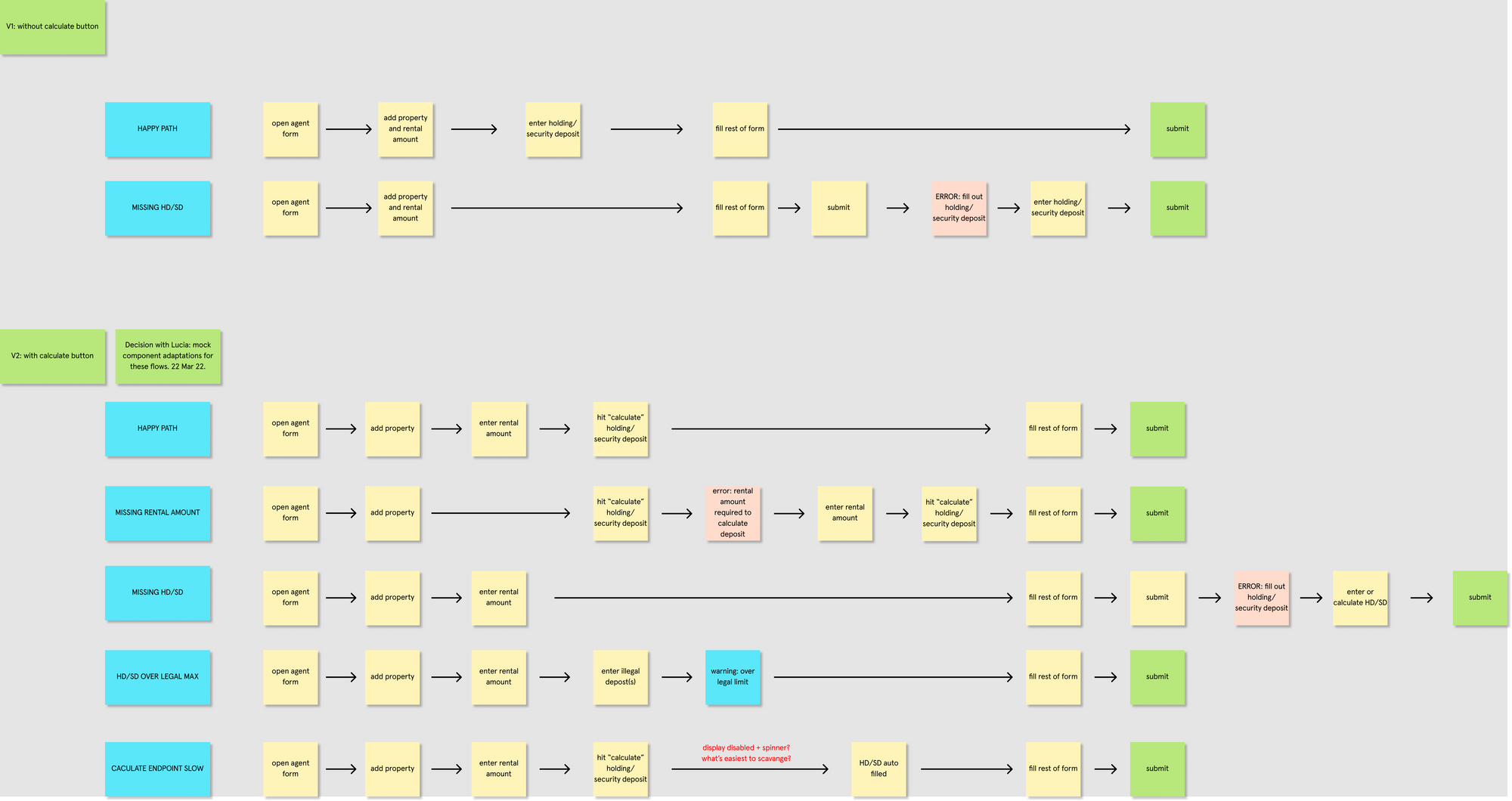
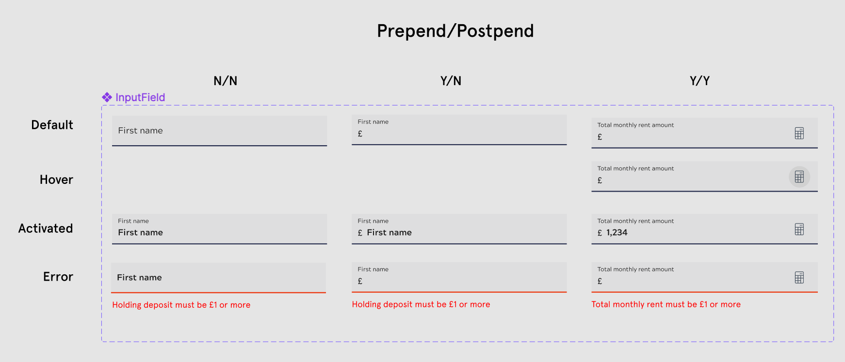
Deposit amounts is integral to the rental journey, so I knew it would affect more than a single touch point. I did a User Journey map and workshopped that back to the team for input and correction.
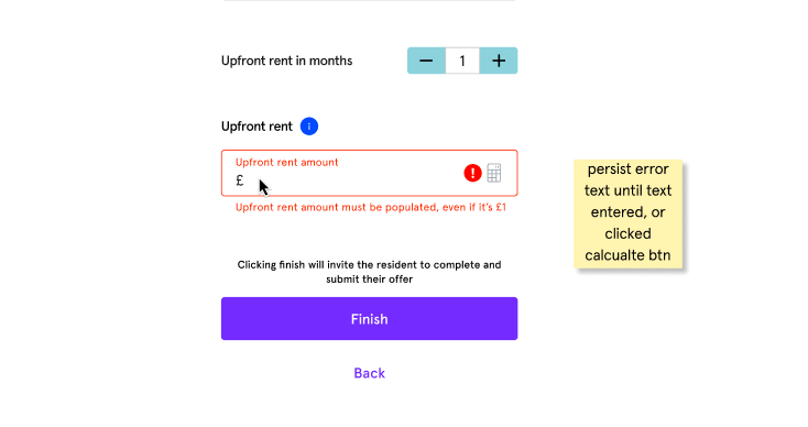
The biggest value for me was making the error cases clear; in all the forms, total rental amount was required in order to calculate all the other deposit amounts.
In addition, I could ask for engineering input any initial ideas or constraints we might have when building this feature.
Why: this allows us to assess what flows this would affect, how the flows worked, and describe how we want it to work. It quickly gets everyone on the same page, and highlight any gaps, before beginning the ideation and prototyping phase.
In total there are 3 existing product flows that this feature affected, and involved 2 design languages: the recent B2B interface, and the older B2C interface.
Identifying a solution
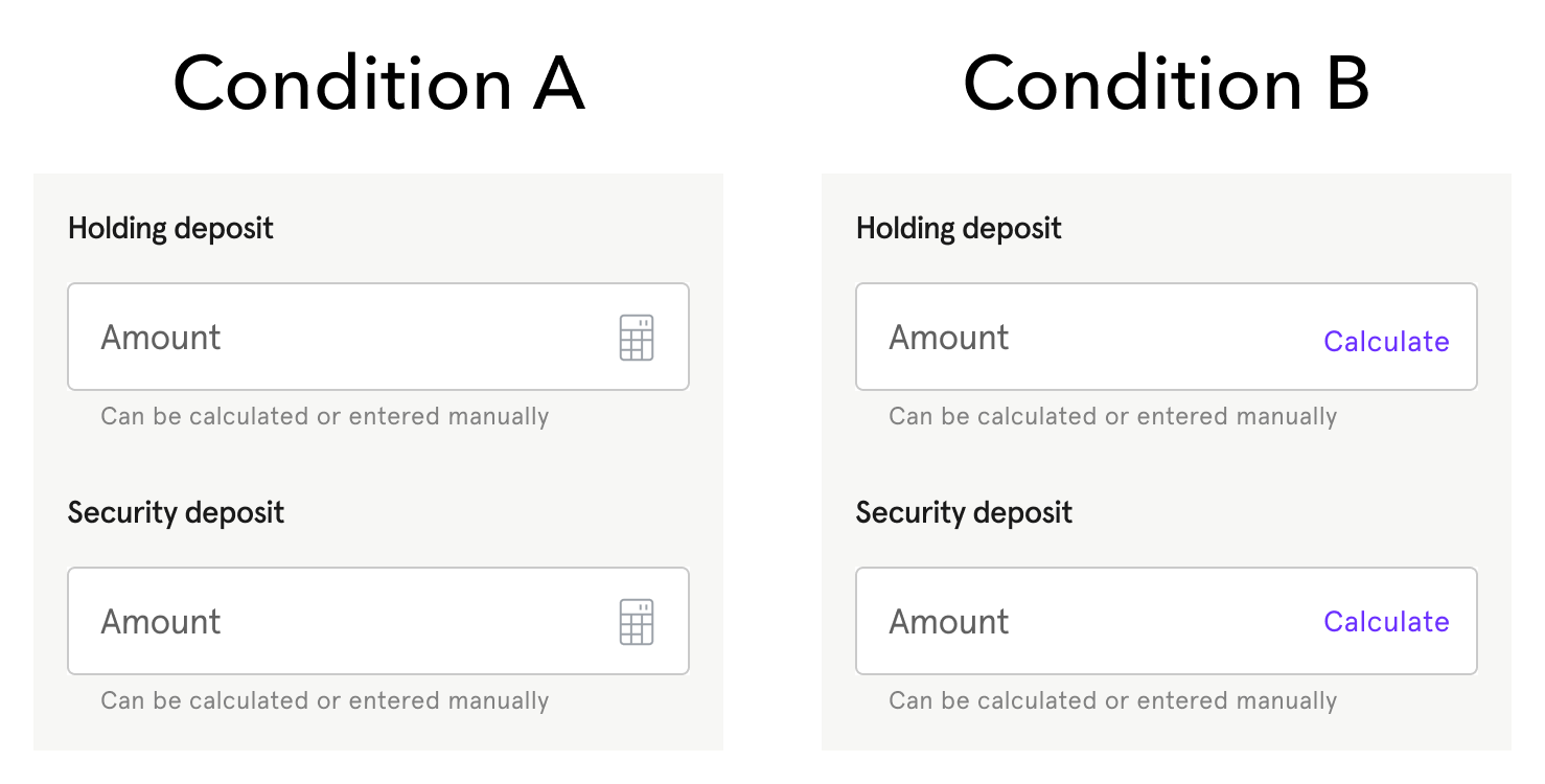
As a starting point I like to refer to any ideas the Product Manager has. This helps me guide our thinking to the best solution. Initially we used a simple button next to the text field. I mocked this up, and jotted down some thoughts the partner might have.
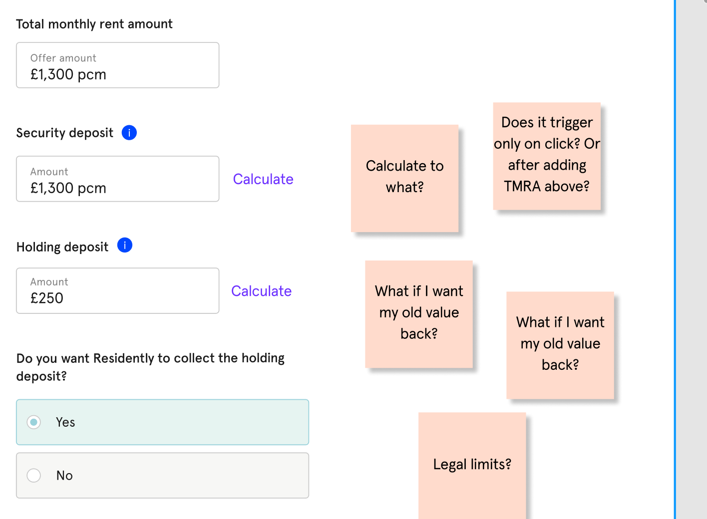
Here's some of the ideas I experimented with, in collaboration with the Product Manager.
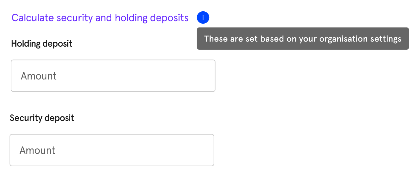
At this point, we found that it was difficult to visually communicate that:
- this singlular button fills in these two fields
- the rental amount is required to calculate both of them
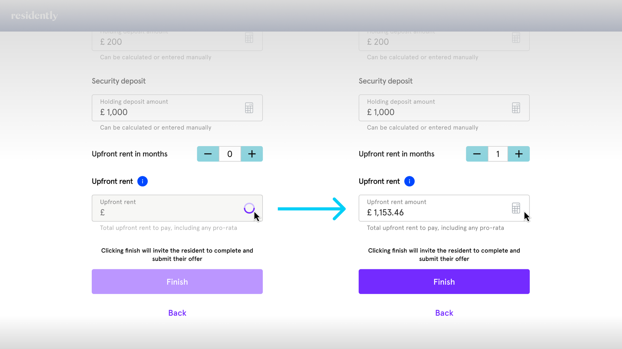
This then iterated to what we had below, where visually both fields are related:
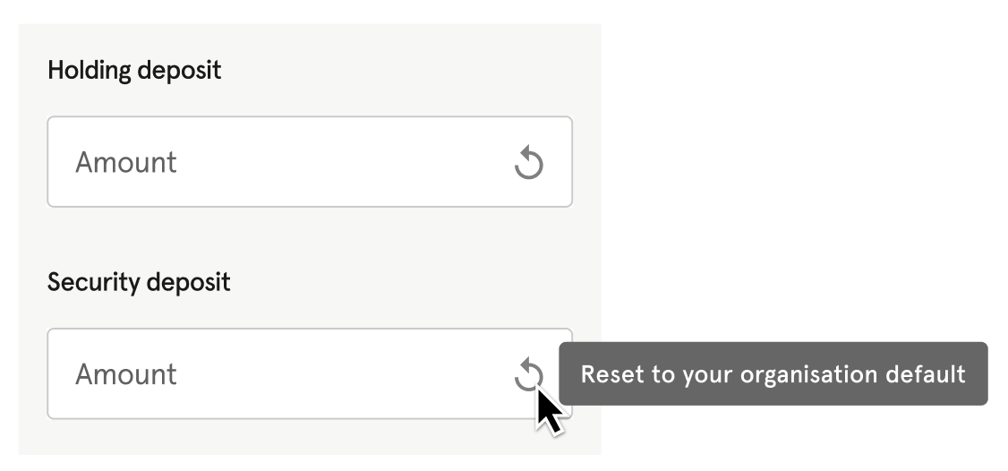
Above you can see that I wanted to integrate the button into the text field itself. My thinking was:
- It's available on MUI's text input component
- Date picker is an existing, similar, and successful UI pattern
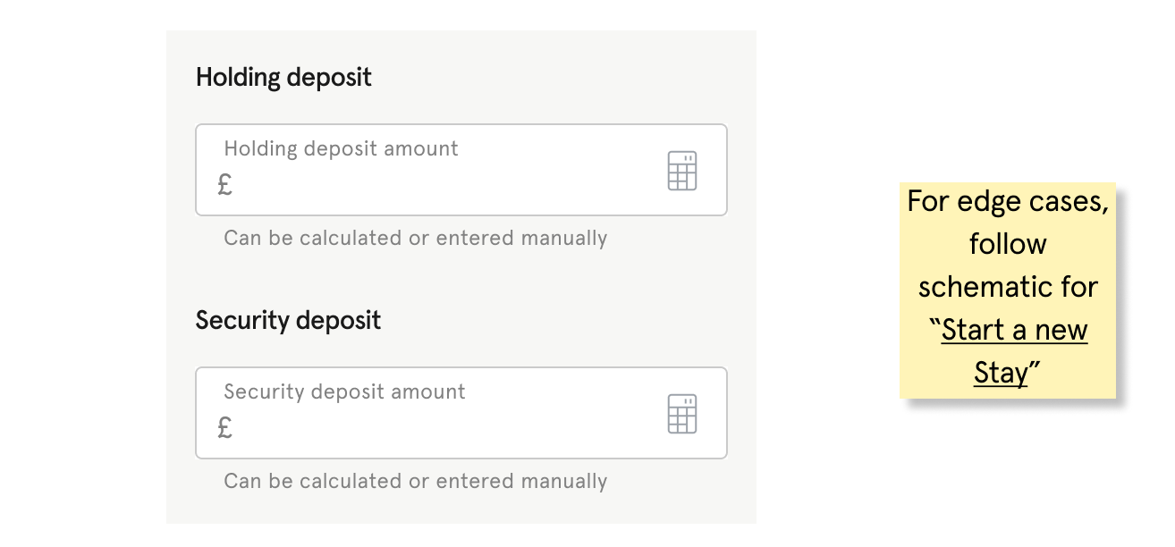
In the end, this was the result of this stage and became the first iteration to go forward to validation.
Assessing technical constraints
Once I put together a static set of screens that described the solution, the edge cases, and I showcased it to our Tech Lead and Product Manager. I wanted to assess any deeper technical constraints we might have.
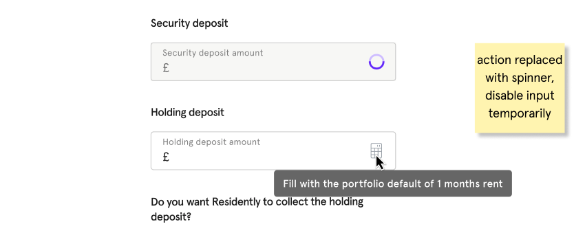
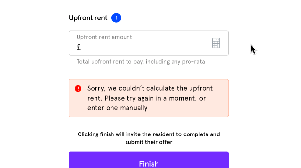
This was helpful as our Tech Lead helped to identify 2 extra cases I hadn't anticipated:
- The calculation process takes a while, but the field was still editable
- The calculation process failed, and we need to tell the user what happened
For these I could disable the field, and feedback to the user respectively.
Designing for the other design language
The tenant facing side of our product had a completely different langauge, and had a different set of UI components. This made it difficult to compose a flow together. In the interest of efficiency I had to create a set of pseudo-components to work with, and place them on top of screenshots.
This was okay since we were focusing most of our efforts on the partner side of the product, and resident facing work was occasional.
Validation
As part of the validation phase, I answered 3 areas:
- Overall usability—was this flow understandable, and easy to navigate?
- Icon or a word—is the icon enough, or would a word be clearer?
- Error cases—what's the clearest way to feedback and help fix errors?
Assessing overall usability
For this work I attempted to set up User Testing, as a quick way to get some general feedback and see if the flow was navigable.
Unfortunately our subscription came to an end and wasn't renewed earlier in the year. I tried setting up an ad-hoc test, but it would cost around £500 for this single test. I couldn't get the budget, and it would take a while to renew our subscription. Instead, I sought to test internally.
As part of internal testing I used 2 types of users:
- people in the product team who haven't worked on this feature
- our operations team who work closely with our partners, daily
In conclusion the results were successful. No one struggled with the flow, but I identified a few smaller issues. Some of the feedback quotes were:
"Why is it in a grey box? Is that necessary?"
"Would the word 'Calculate' be clearer maybe?"
"That looks like a date picker icon!"
These I sought to address in a few follow up, smaller tests.
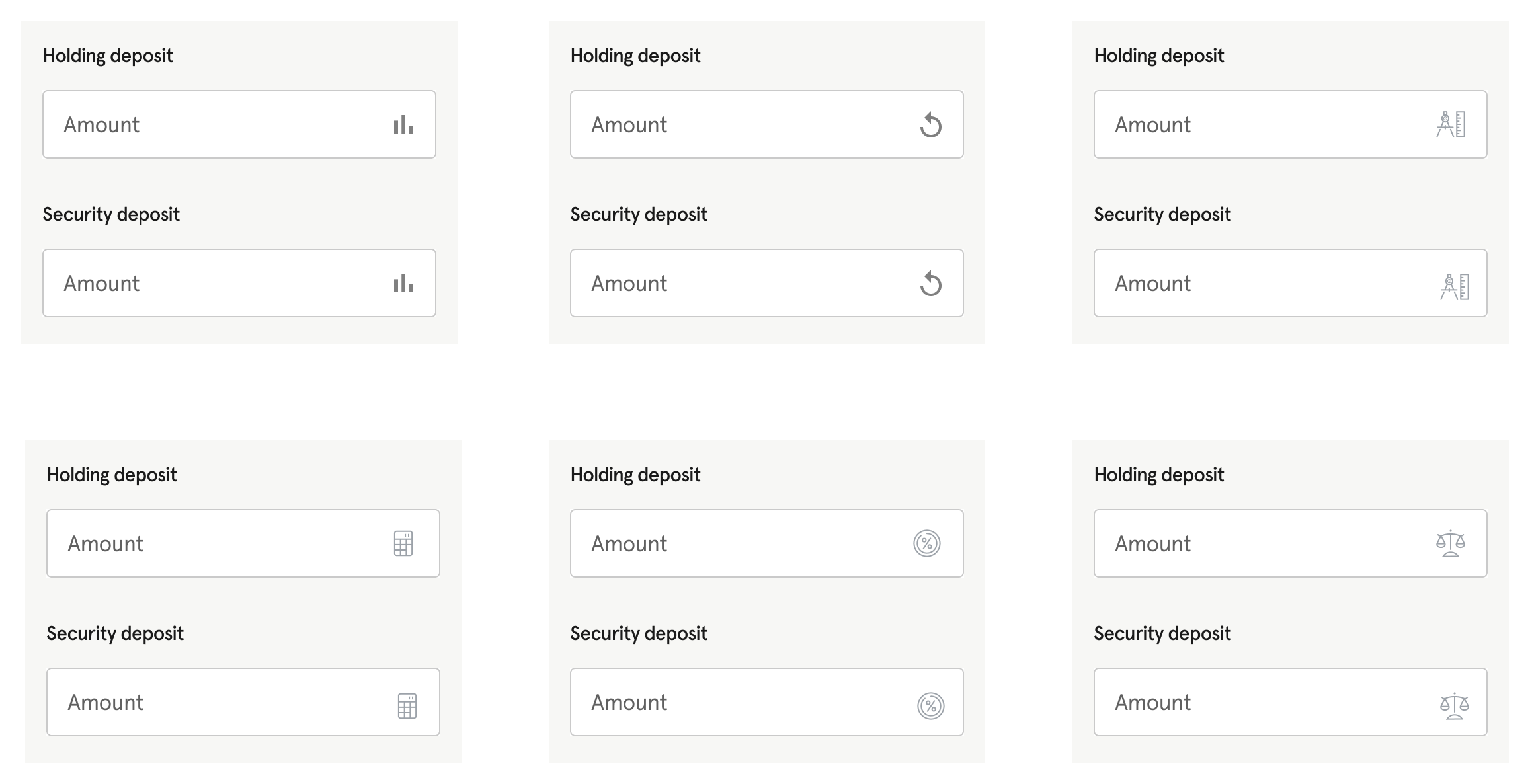
Uncertainty in using an icon, versus the word
I created the two conditions we were thinking of, mocked them up, and shared them internally for feedback. Overall, we landed on an icon being consistent with the rest of the product, and more flexible when composing layouts in other parts of the system.
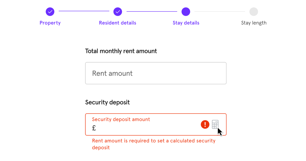
How to notify that rental amount is missing
When the rental amount was missing, we couldn't calculate any of the other fields. As part of validation I wanted to verify if:
- The rental amount field should error, since that's where we need to action it
- The security deposit field should error, since that's the field that needs something else
After internal testing to those who hadn't seen these screens, I found that highlighting the rental amount field could be disorienting and confusing. In addition, other forms may have these fields further apart, requiring a "scroll to" behaviour. Finally, it was less complex to build with the latter style.
Therefore, I accepted this as the pattern to use moving forward and absorbed it back into our Design System.
Post launch iteration
After validation we built and released this on the live system, and trialled it with a few partners before building and rolling out the other two flows.
One thing that was easy to change post-build, and was still an open question, was the feedback we had earlier.
"That looks like a date picker icon!"
After a quick look through the icon set we were using, mocking them up, and sharing them around internally, we were convinced we had picked the correct one. In addition, partners were not experiencing issues performing the task, so we left it as it was.
The final design
After all the iteration, and designing for all the edge cases, the final design looked and worked like this:
- Each field worked independently, and was sometimes used without the other, so the grey background was removed
- We couldn't agree on an alternative icon, and decided to "test in production" given it was easy to change
- Microcopy on the tooltip and error copy was finessed for each case
Outcomes
After this process, given the time constraints, this was enough for us to close off this feature for now and iterate properly later. After the entire MVP was delivered, I created a broader research strategy to validate the "design debt" we'd taken on from this and other pieces.
In total there were 3 main outcomes from this work, found through Hotjar analysis, partner helpdesk requests, and speaking with our Operations team:
- 0 requests to amend deposit amounts were raised since release
- 0 requests of "incorrect upfront amounts" were raised by partners or tenants
- Greatly improved speed to fill the form
Further work
Reflecting on it now, here's what I'd do differently if I could go back in time:
- Secure access to user testing tools before any big deadline—whilst I found workarounds for user research and validation, it was unfortunate that we had to go for a long period of time without any tool in place.
- Be more open to diverting from Design System guidance—upon reflection and discussing with others, the word "Calculate" feels more correct here. Plus, this icon approach clashed with another piece of guidance: "avoid using unlabelled icons".