iOS 13 Silence Mode
It isn't that long ago iOS 13 came out, and there's been quite a few quality-of-life tweaks made. Let's have a look at one small feature I noticed that I think makes a world of difference.
Design Solution
Here's what used to happen on your phone:
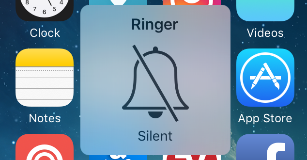
In iOS 12 and earlier, when flicking the physical silent mode button to the 'on' position your phone would make a short vibration and display a bell or volume icon with a cross through it. This would signal to the user that it had entered silent mode. Flicking the switch into the 'off' position would put it back into ring mode and display the restored volume level.
Let's see what happens now.
Activating silent mode
When activating silent mode in iOS 13, you get a distinct vibration pattern to indicate you've done something similar to how it worked before. In addition, you would also get a notification slide downwards on to your screen from above.

Deactivating silent mode
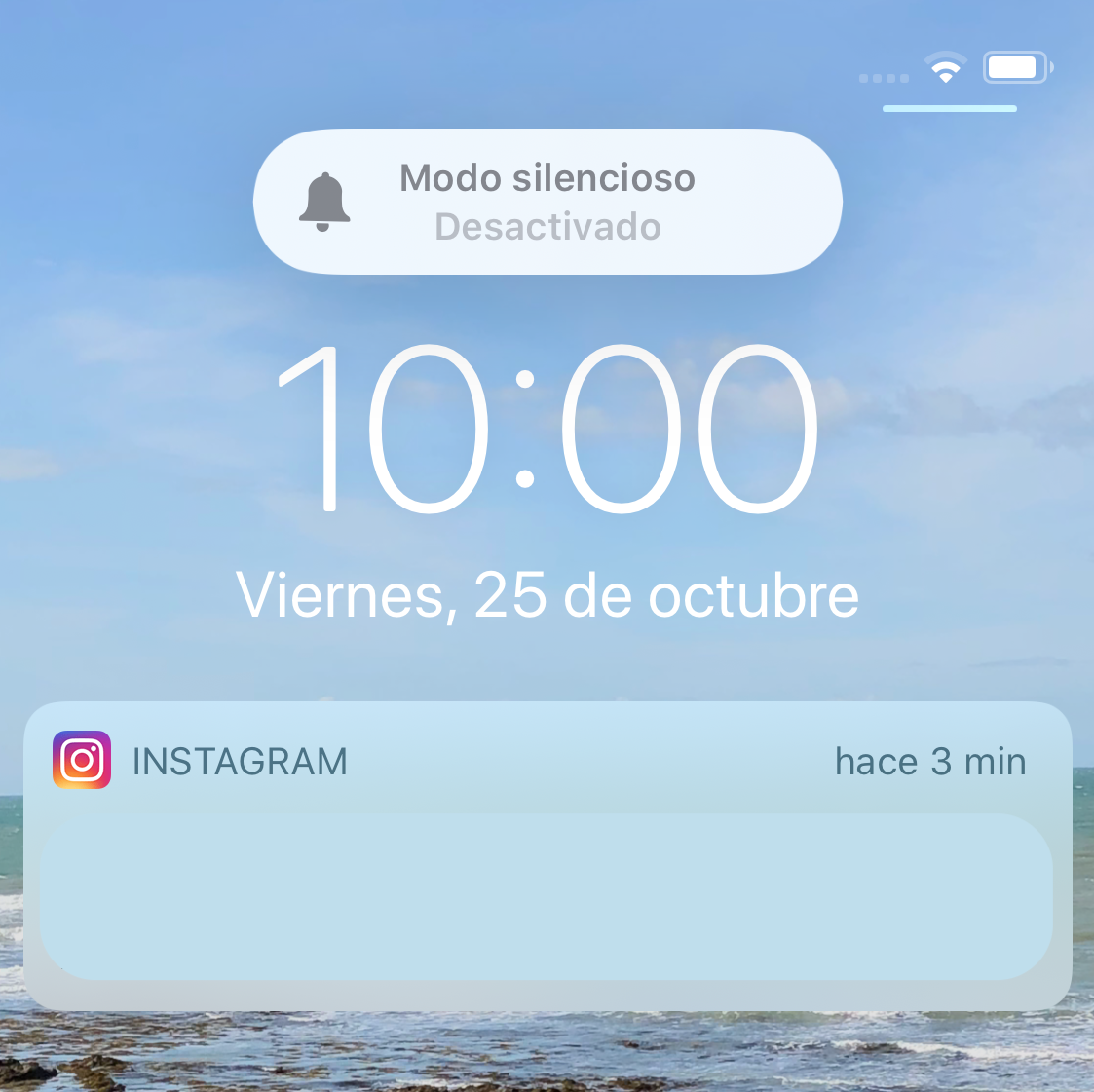
When putting the phone back into ring mode, there's no vibration as was the case before. This time however, you get a similar notification slide downwards like when you switch on silent mode informing you of what's just happened on your phone.
Design Critique
Based on the new layout and interaction above, there's a few benefits to the new design that are easy for me to see:
Current mode is clearer
The use of colour is the primary mechanism by which we can see if the phone is silent or not. In silent mode the bell icon is in red, taking up real estate, as well as the 'Activated' message being in red. In contrast when deactivating silent mode, the colours are grey and muted.
In the previous version of this interaction, the grey muted colours used for both silent mode activated and silent mode deactivated are similar and can easily be confused with each other. The use of colour here breaks the visual hierarchy and lets you know what's just happened.
Your view is not obscured
Previously the notification would be center stage on your screen and cover whatever content is present. If you were reading something or watching a video and needed to quickly turn silent mode on or off, you would have to wait for the notification to disappear. With the new location and minimal footprint on the screen, friction is taken away from continuing the task you were doing before.
As for disadvantages? Well, I can't see any.
Conclusion
It's a small change but has a massive effect on how millions of people conduct and use their mobile phones. The design team have made the change in mode more prominent to the user, whilst minimising interruption to the user's workflow so they can continue what they're doing. I'm sure some of you can think of another feature that achieves the same effect *coughvolumechangecough* 😉.
All in all, I'm a big fan.