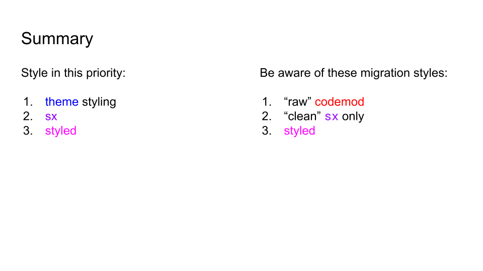
Building both sides of a Design System
How I architected the design, development, adoption, and documentation of the Design System at Residently consisting of over 100 components. Complete with Storybook, a zeroheight-like documentation, Figma libraries, and Atomic Design file structure.
Hint: it requires collaboration.
Table of contents
Overview
Timeline
- 1 year and 6 months
Roles
- Technical Lead - 1 year
- Lead UX Designer - 6 months
Team
Over the entire effort, I collaborated with every single person in the wider product team. This consisted of:
- 3 UX designers
- 5 Technical Leads or Architects
- 3 Product Managers
- 20+ Software Engineers
- Head of UX
- CTO
- VP of Product
Part I: "as a Technical Lead"
Assessing the situation
As keen as I was to get started on one of my passions, I understand how important it is to observe and learn before taking any action. This not only respects the existing team and how things currently work, but also allows me to be made aware of any limitations that may exist. Doing so helps me prepare a strategy to best approach instantiating a solid Design System.
Some of my findings included:
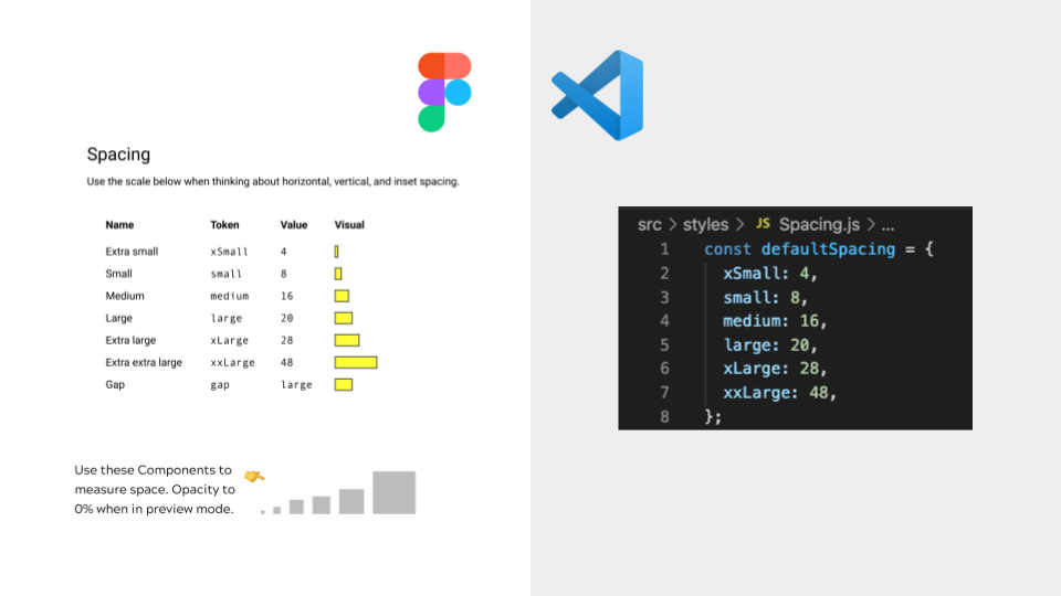
- There are some basic attempts at design tokens in the code
- Design and Engineering were unaware of each other's efforts
- We had 9 different back buttons coded in the mobile app
Testing the waters
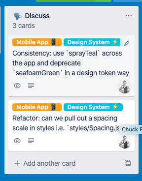
Once I realised that I could add some value by looking at the Design System, I started raising tasks on the Trello board to help with the effort. I used the "Discuss" facility—this was a way we could track all the tasks that we thought were important to be aware, but weren't a top priority for any of the product team. We had a rota where all engineers would eventually work on one of these tasks, so I felt it was a great place to start teaching others and bringing awareness to a different way of doing things.
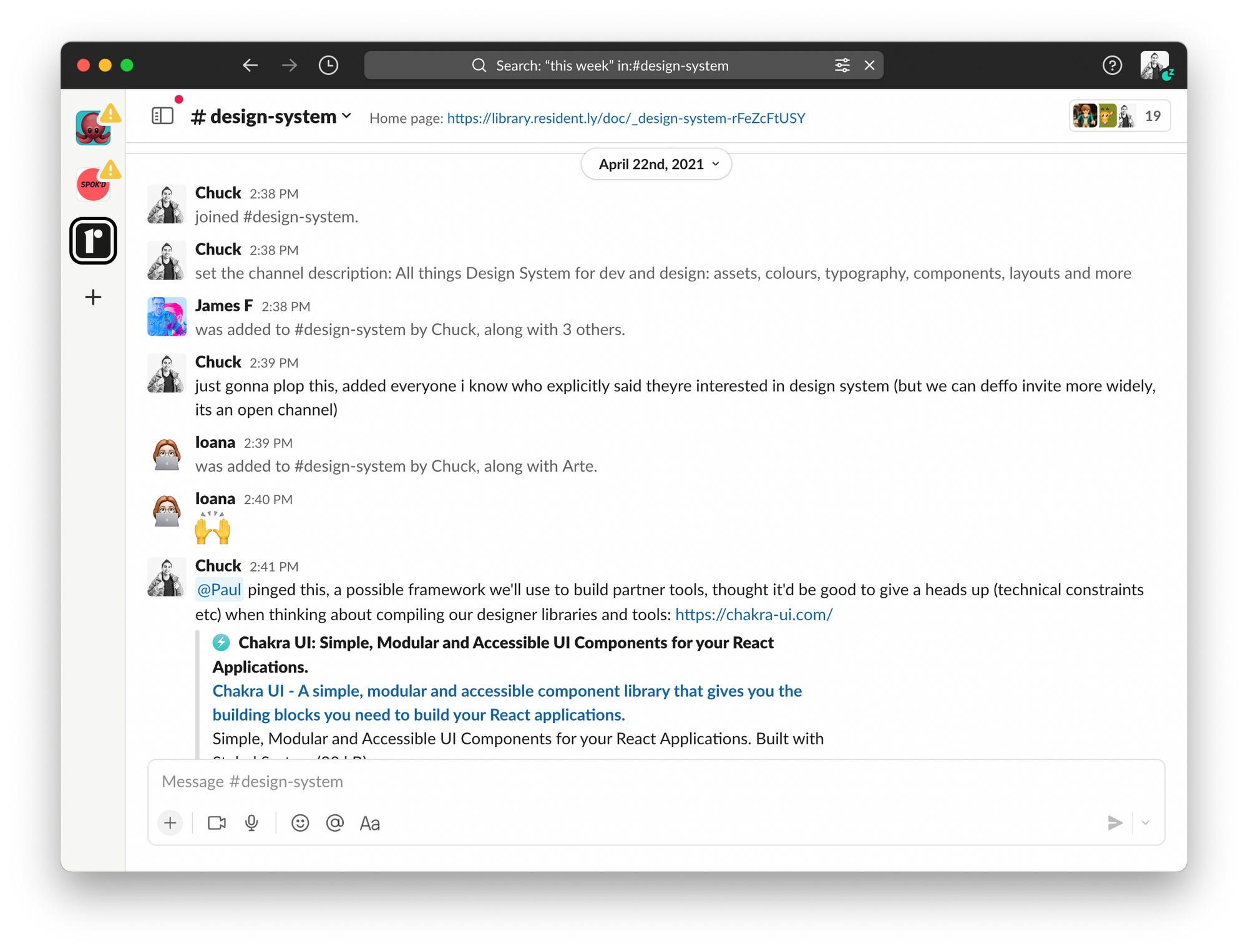
Garnering adoption amongst Engineers
I held a talk about Organic Design Systems to an external meetup, but a couple of colleagues joined me. From there they could see a portion of the grand plan, and I felt that I had earned their respect when speaking with them after. This also enabled me to help gain allies and advocates of the whole Design System effort.

Spotting an opportunity to start
I wanted to move more towards Atomic Design and having organised, polished, reusable components that everyone knew how to use and compose.
"I knew Atomic Design was for the Engineers to have a common language... I didn't realise it applies to Designers, too!
— Sam Phillips, CTO at Residently
- Introduced the idea during standups to my product team
- Held a walkthrough session to "pitch" how it'd work to my engineers in the codebase
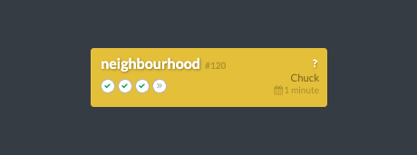
- Had a greenfield project, neighbourhood, we could lay the foundations and provide surface area
Collaborating with Design
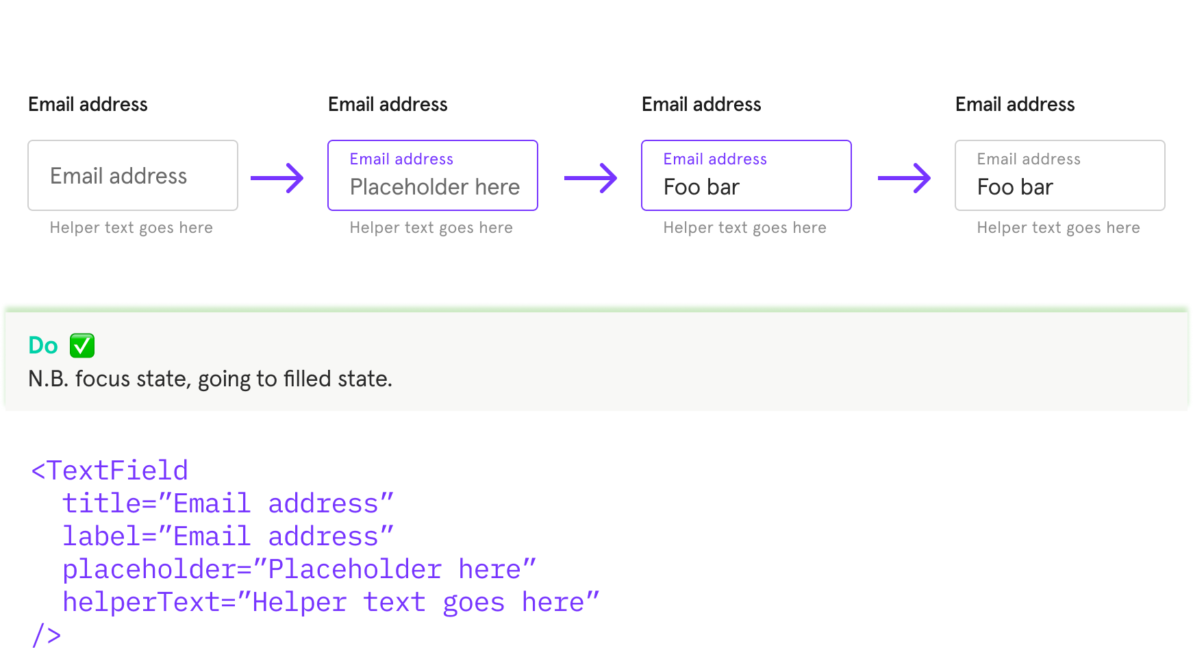
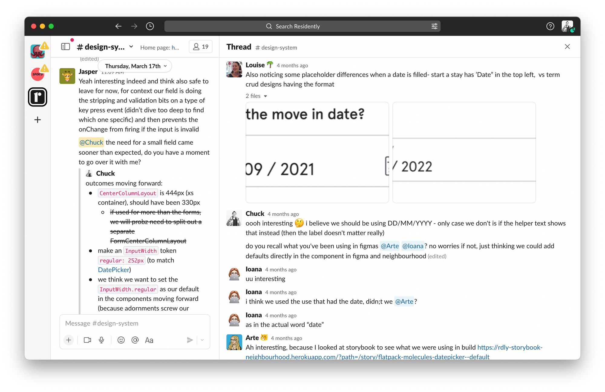
Once the engineers had a rhythm and we fine tuned our approach to one everyone agreed on, I turned my attention to collaborating with design. Designers were the ones creating the handoff materials the engineers would use as a reference, so I was keen to start joining up both sides. One key event was defining the typography scale.
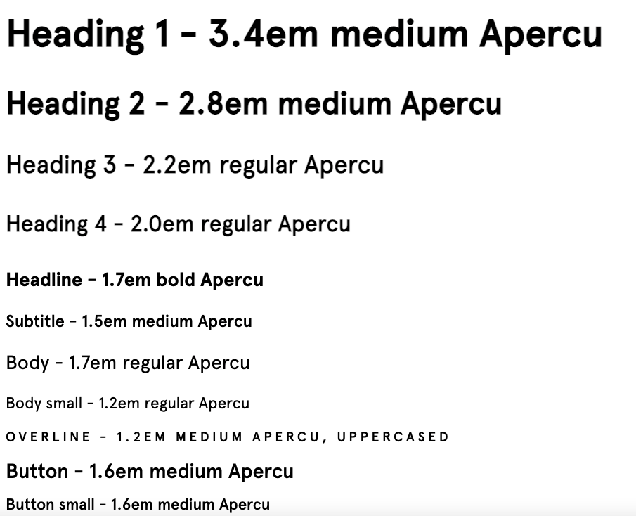
Originally, one of our designers had created a typography scale with 14 different variants. Double checking the mui library (material-ui at the time) we were only able to configure 13 variants. After jumping on a call to collaborate together, we settled on 13 variants that design as a whole could work from moving forward. Many other parts of the design system in Figma was defined in this manner.
Part II: "as a Lead UX Designer"
After negotiating a change in role at a time when I believed my team was more than capable and had the tools and processes to make good decisions, I migrated into the Lead UX Designer role. This gave me an opportunity to fill a skill gap in the team, as well as take the Design System even further.
Here's a summary of the key deliverables and milestones:
- Deliver a Design System Theory session to the wider team
- Conduct 2 Figma tutoring sessions
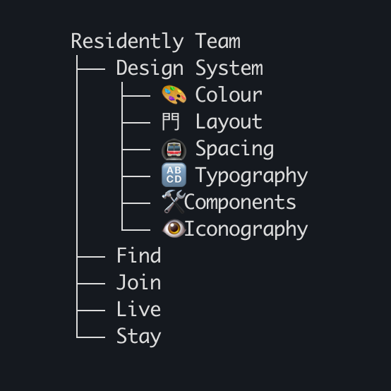
- Figma files: components, typography, colours, grids, spacing,
(Later consolidated this to: styles, components) - Knowledge base in Library (getoutline)
- Setup a Design System Kanban board to manage and prioritise incoming work
- Sharing updates: weekly summary, fortnightly show and tell
- Contributing: take onboard show and tell feedback, messages in channel, and fortnightly refinement of the backlog with designers at first
Deliver a Design System Theory session to the wider team
What: I hosted a 30 minute session to the wider team about the theory of Design Systems. The presentation deck is available below:
Why: I wanted to set some clear expectations of what I aim to deliver:
- what are tokens, components, and patterns for designers and for engineers
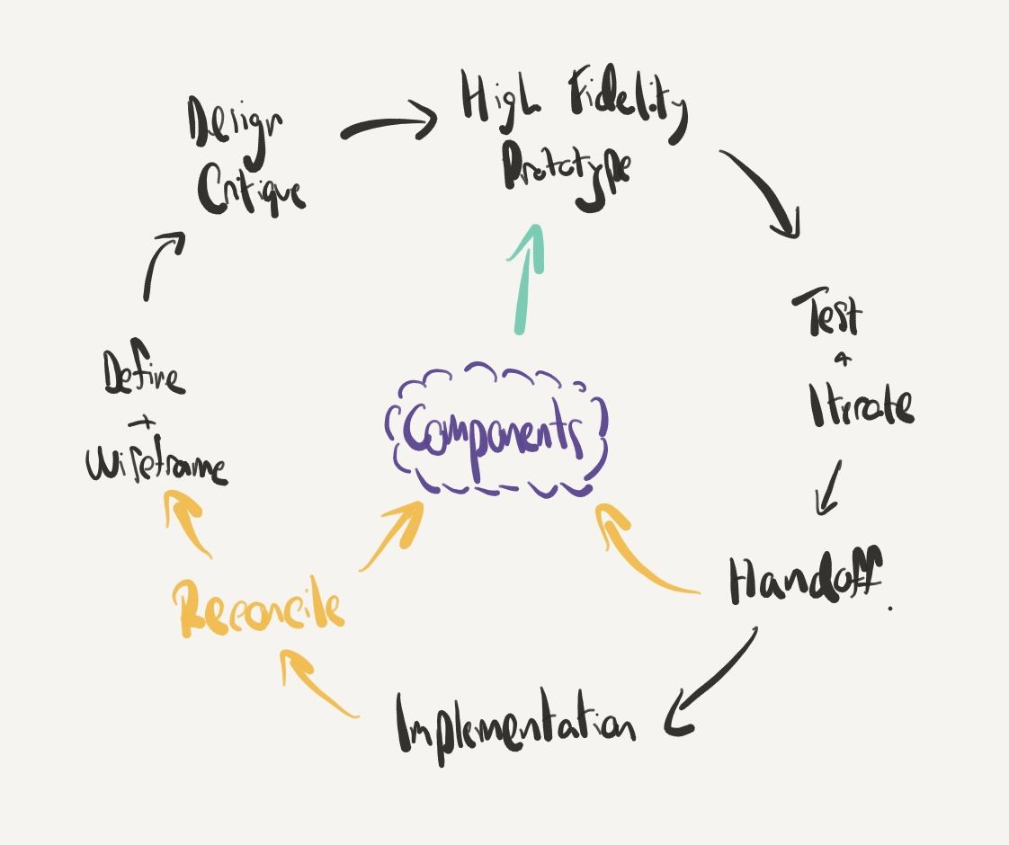
- the broad lifecycle—how patterns are found, captured, and accessed
- the product defines the patterns, not the other way around
Conduct 2 Figma tutoring sessions
What
I delivered 2 interactive sessions using a set of prepared exercises, that I used to help teach more about assembling prototypes and Auto layout.
Why
If as designers we're using differing techniques to assemble our prototypes, we're not going to get the best out of the components of the system. In a previous role I quickly learned this makes a difference. In addition, I could learn if there were any new techniques that the others were using that I wasn't yet aware of.
My goals were to:
- have a consistent method of assembling prototypes
- raise awareness how to balance pixel precision with speed
- build proficiency with Auto layout
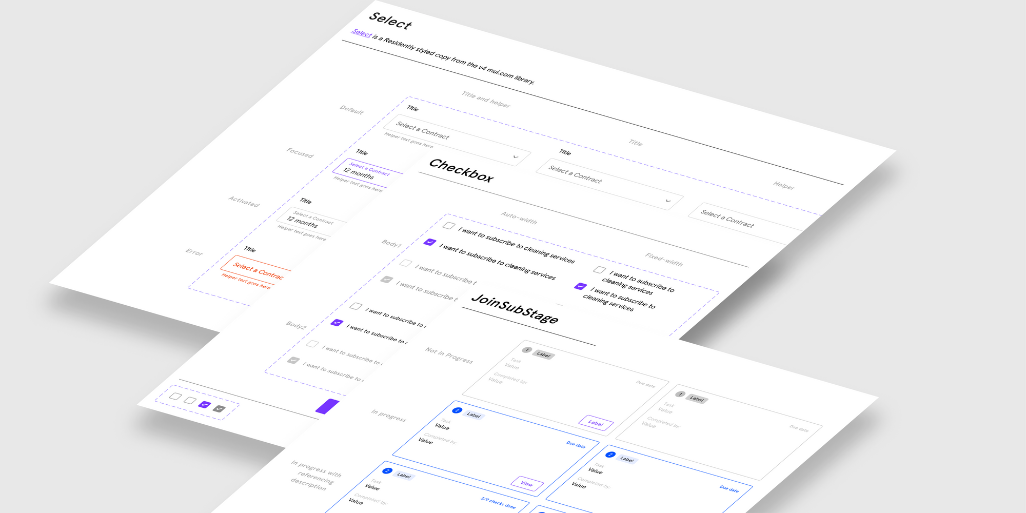
Setup Figma library files and structure
What
I did a stint of consolidation activities to complete, simplify, and organise a collection of styles, components, and patterns using Figma's "Team Library" feature.
Why
To provide all designers a clean, robust starting point to build the prototypes needed to design and illustrate product features. With a consistent set of building blocks, I aimed to:
- Ensure Figma files were easy to update or fix retrospectively, as required
- Avoid trivial or repeat questions from Product Managers and Engineers at handoff time that aren't about delivering business value
- Reduce the amount of copy/pasting of rogue components that could be composed better
Learnings
Originally this consisted of individual files for: Typography, Colour, Grids, Spacing, and Components. After watching an office hours level up by Figma and their Config conference in 2022, I consolidated this to simply Styles and Components.
We didn't have a broad enough brand or set of styles to necessitate independent files.
Setup 30 Figma components with Properties and Variants
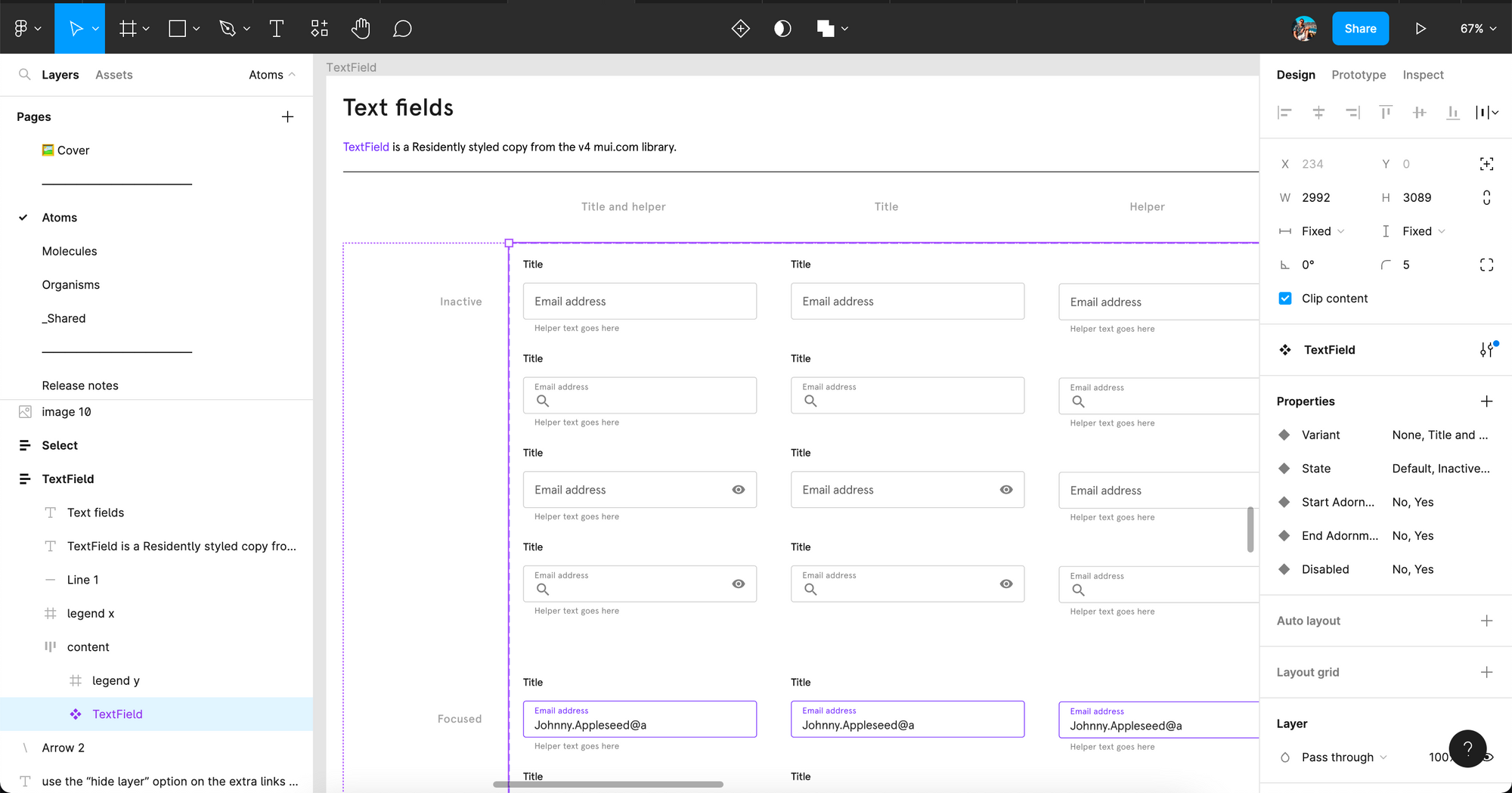
What
We had an existing set of components, but they weren't using the latest features available at the time. Properties and Variants were used lightly, but could have been utilised more to balance interpretability and buildability for engineers, but ease of using and composing designs for designers.
Why
Many different states are set up manually by designers, such as error states or adding in icon adornments, and weren't consistently matching how the mui library provided them.
To reduce effort spent on updating states and adding icons by hand, using the Material Icon pack and providing 80% of components and their states we most often gave us a massive boost to efficiency within the team.
This way, we could focus on solving the business problems for our customers instead of solving and agreeing how to implement standardised and recognised building blocks of the web.
Build a knowledge base
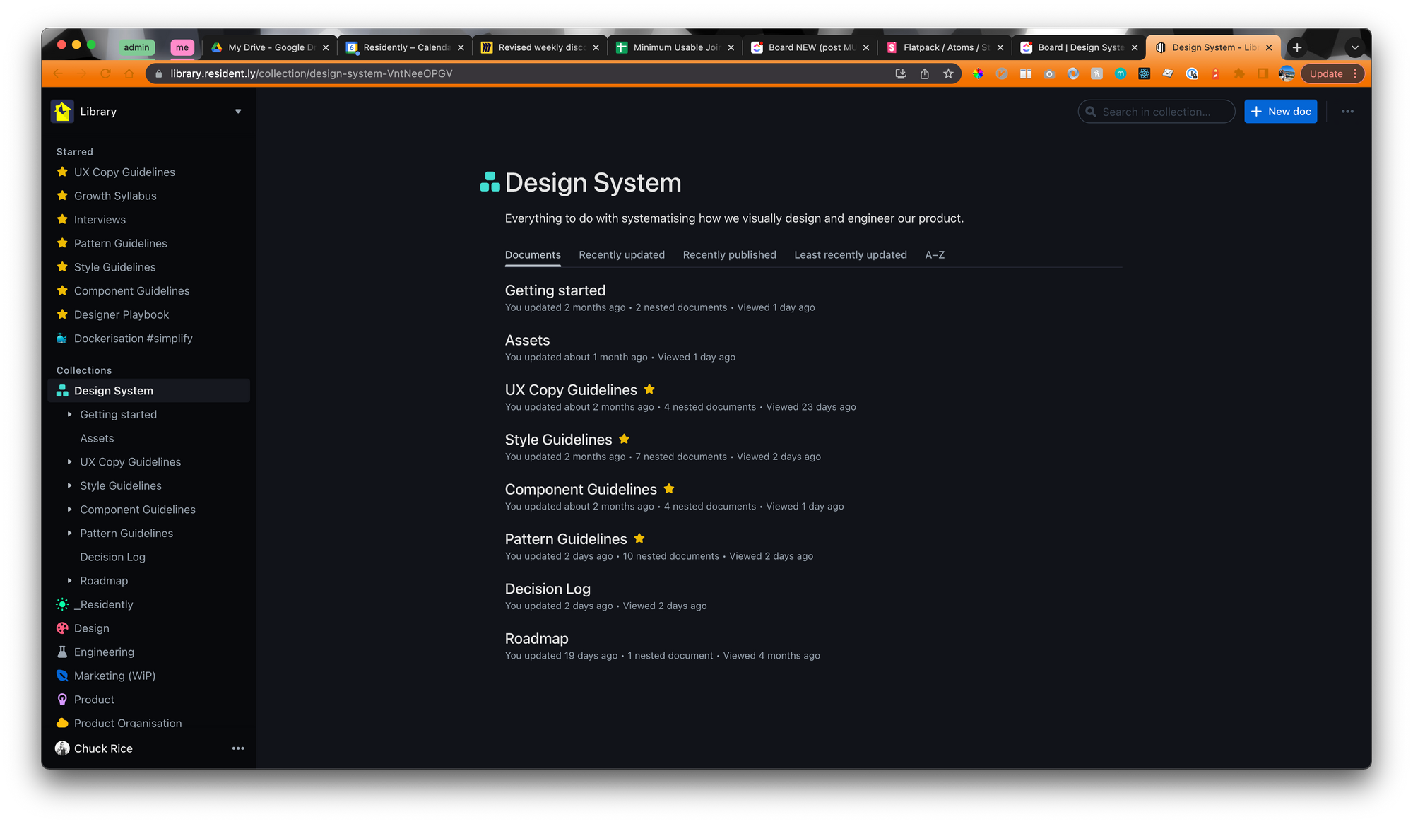
What
Similar to tools like zeroheight, I used our internal wiki tool "Outline" to start curating a Design System library. This covered things like "Getting started" for each person's respective role, to the roadmap, changelog, all the way to detailed patterns guidance such as "Forms" and "System feedback".
Why
In my theory presentation I mentioned that the anatomy of a Design System is spread out, and you'll see and use different parts depending on your role in the business. By creating a "starting point" I'm able to always refer everyone to one place and provide the extra guidance required to explain nuances of Components and Patterns.
From there, I could build a habit amongst each of the product teams by signposting to Outline whenever a question arose. Often this was either when the guidance could clear up confusion, or I could capture brand new guidance that didn't exist yet.
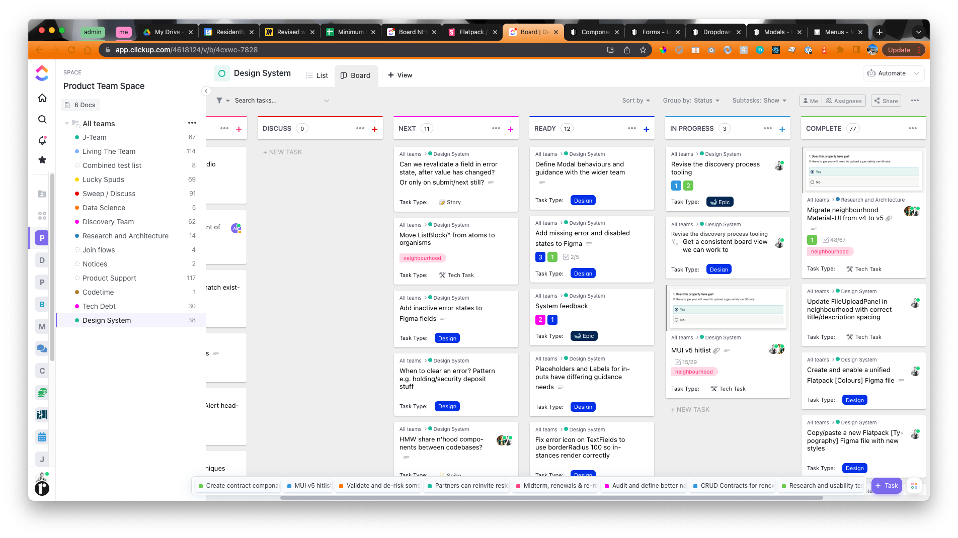
Setup a Design System Kanban board to manage and prioritise incoming work
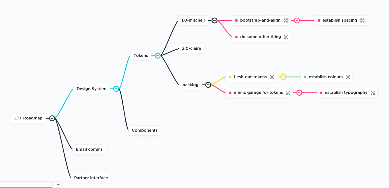
What
I created a backlog and Kanban board of work in our project management tool ClickUp for the Design System work. I used Kanban since that's how the wider team was already working, and my time could sometimes be spent assisting more complex design efforts or substituting into a team at a moment's notice.
Why
I wanted to:
- clearly indicate to anyone at any time what I was working on
- show to others what work was on the near term, and the long term
- provide a facility to gather input from others, and facilitate any collaborative prioritisation sessions
- when the time arose, enable others to get involved by delegating subtasks
Sharing updates and changes
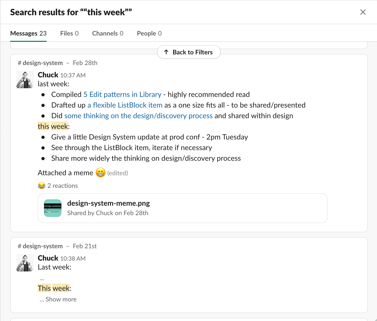
What
I did a weekly summary message in our internal communication tool, Slack, covering what I did the previous week, and what I intended to do during the current week. In addition, I hosted an optional fortnightly show and tell session that everyone was invited to.
Why
By sharing a weekly written update I was aiming to keep the system forefront of people's minds, have a place to find the links to the updated or new resources, and have a chance to input to what's coming up. The show and tell session enabled me to share these updates visually, and facilitate any discussion and thoughts people had.
Enable contributing to the system
What
Take onboard feedback from the fortnightly show and tell sessions, encouraged messages in the #design-system channel, and setup fortnightly refinement of the backlog.
Why
Whilst I have my own preferences and opinions, the system has to work for the team. Taking on a servant-leader role I wanted to ensure that everyone felt they were able to participate and shape the system as it developed. By doing so, I hoped to share that sense of ownership around. I did get help and input from various individuals to grow it by either raising gaps, or fixing documentation and bugs.
Get feedback from the wider team
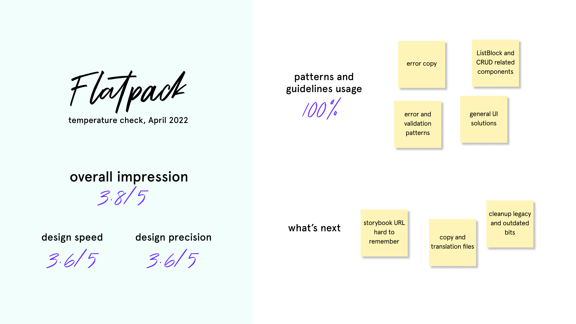
What
I did what I called a "temperature check" to get feedback on people's impressions of the system, if we were using the materials I was working on, and if anyone had suggestions for the roadmap ahead.
Why
I was keen to improve how everyone felt about our design speed and design precision. In addition, my perspective is different and I wanted to see what I could be doing to help the team further.
Learnings
One fantastic outcome was that storybook was difficult to find as it used the Heroku generated URL. I immediately created an easily memorable URL and shared that out to the team.
Part III: upgrading from mui v4 to v5
Overview
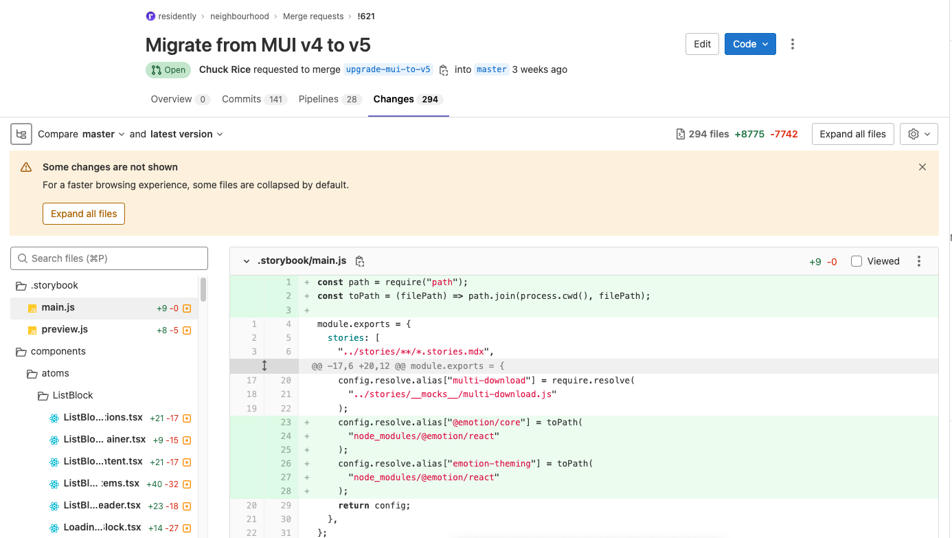
Doing this upgrade involved:
- 2.5 months of work (since April 11)
- Nearly 300 files updatedAlmost 200 components updated
- Almost 200 components updated
Additionally, I had a small amount of help from our Technical Architect at the end to finish migrating the DatePicker component. This was in order to deliver the upgrade within a release window that would be minimally disruptive. Otherwise, I did 100% of the work.
There were four main reasons:
- No more Materil Design updates: material-ui v4 was no longer receiving updates, only security patches. Any changes to their design patterns would not be reflected
- Performance of the frontend: mui v5 provided better performing base components, particularly Box. I was keen to maintain a high experience standard for our partners
- Ensuring a easily maintainable codebase: we have another codebase delivering part of the resident experience, that is difficult to work with and we assessed wasn't worth upgrading at all. It's quicker to rebuild in something new. I wanted to avoid the same scenario
- Saving engineer time: documentation on Google search results returned the v5 documentation, but until we upgraded engineers needed to navigate by hand to the v4 documentation
During the upgrade
Once I started working, I had to migrate all the components and remove the old material-ui dependencies before I could verify what was causing the failures. I discovered a few tests that were fragile, and a few that did not test what they said they did. It turned out to be a great auditing exercise to further improve code quality.
Briefing the Engineers
In order to prepare all the engineers for the incoming upgrade, I made sure to communicate using more than one method of what to expect. First I did a written update and a wiki article in the #engineerig channel. A few weeks later, I shared how they should style things moving forward in v5, and what types of migration style they'd see in a presentation. This facilitated a smooth adoption of the new work.
Merging the changes
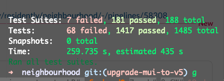
In order to have a smooth upgrade, I ensured that I had consistently passing runs on both the local test suite, and the integration tests across the platform. The integration tests are notorious for catching engineers out and usually had a 50% pass rate. After merging, my branch passed every stage the first time.
Outcomes
The core outcomes experienced were:
- Time estimate to rebrand the mobile app went from 2 months to 2 weeks—a 75% reduction in time due to design tokens.
- Designing features and fixes that used to take 1-2 days, could be delivered in as little as 30 minutes—99% reduction in time.
- Together with the weekly design workload planning I put in place, we went from 8 months delivery time to 4 months—in fact, 1 week ahead of schedule.
- It only took a few days for another Engineer to deploy a resident-facing microservice from scratch, borrowing the setup and components in neighbourhood.
- 0 test failures and 0 functional production issues were raised after I migrated the entire neighbourhood codebase to mui v5—300 file changes made over 10 weeks
In addition, these are known outcomes that any Residently employee (past or present) can also atest to:
- Consistency in our methods and basic design patterns enabled designers to swap tasks at a moment's notice, due to illness or holiday for example.
- Countless discussions were resolvable by referring to agreed documentation.
- Engineers were able to compose and release features more quickly with less effort, and less chance of bugs.
Bonus: it helped further my colleagues careers
What I hadn't planned for, but was pleased to hear, was that the principles of Atomic Design and the Design System were helping those taking that next step in their careers.
"I did a tech test and organised my components into atoms, molecules organisms. They asked me what's that, and after I explained it was grouped by complexity, they responded "oh, that's a good idea". I think that got me the job."
— Ed Payton, Full-stack Engineer (Ruby on Rails, React, NextJS)
Further work
If I had more time, I would love to:
- Make components sharable between all our frontend apps—when I exited the business we had an
npmdependency that could share some basic components, but I was keen to use something like bit.dev to make it more sophisticated. - Flesh out "template" and "formulas"—I firmly believe that the product defines the patterns and not the other way around. As the product expands, more and more patterns start to emerge. Eventually I can create formulas that anyone can use like Lego or IKEA instructions.
- A stand alone "https://residently.design/" knowledge base—whilst our internal knowledge base is great as is, being stand alone both elevates it and I can better guide people coming across it for the first time.