Improving the visual hierarchy of a Webflow site inline with SEO goals
I designed and implemented an update to the visual language and hierarchy of Spoked's existing website, based on a pre-prepared SEO content and goals. In addition, I wanted to ensure it met AA accessibility standards, and is completely mobile responsive.
This is a paid project, and is now delievered and live; it can be viewed at https://spoked.ai/.
Overview
- Client: Rich Lang, Founder of spoked.ai (LinkedIn, Wikipedia)
- Role: UX/UI Consultant, Webflow Developer
- Timeline: 2 weeks consultation, 4 weeks delivery
Webflow features used
- Symbols and Components
- Classes, combo classes, global combo classes
- CMS and CMS Template pages
- CMS import and export
Approach
Understanding the goals
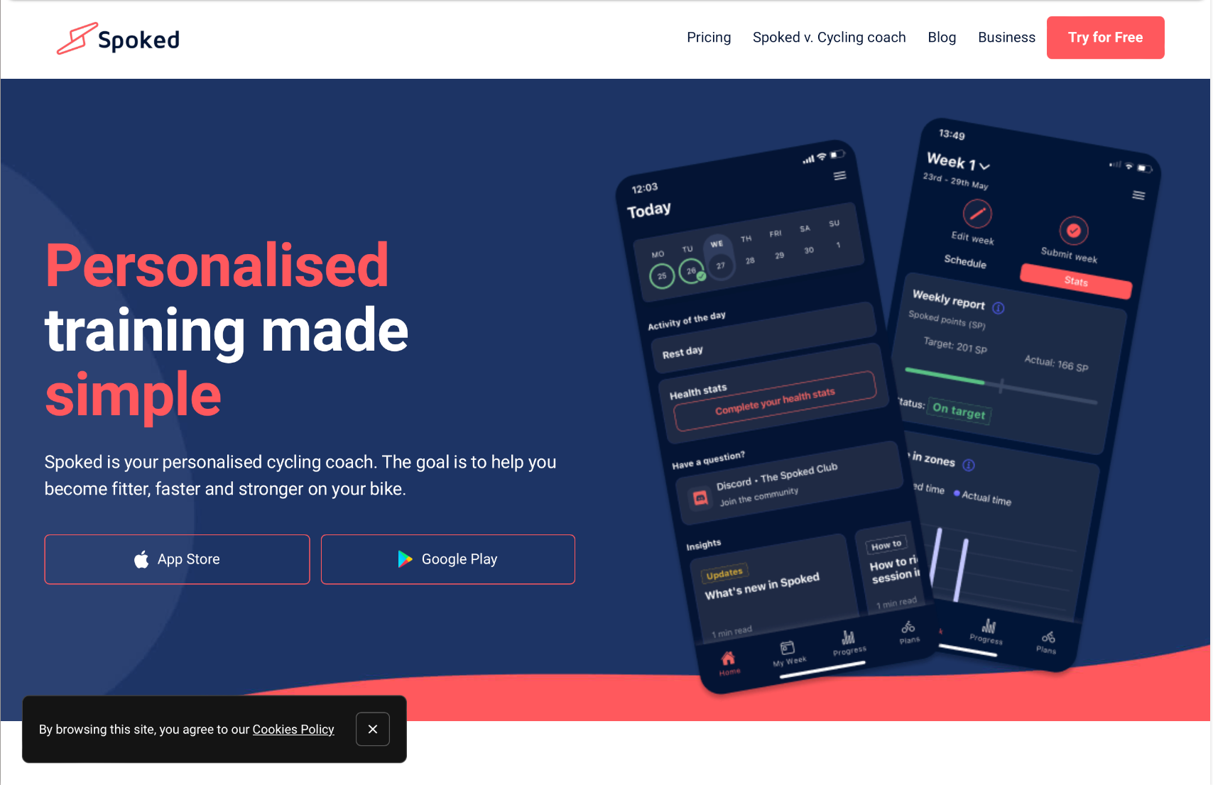
Through various conversations, I learned that the visual language of Spoked's mobile application had evolved and become more refined. This left the website feeling dated and out of sync, and forms the first goal.
I performed a UX audit as a pre-cursor to this project, which gave me a deeper understanding of the visual language and where it could be improved.
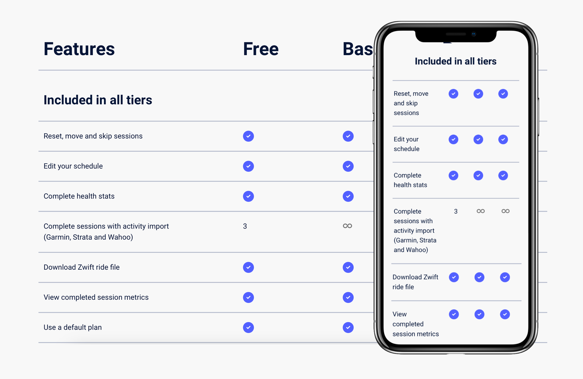
In addition, Rich has been successful in meeting many organic SEO goals such as page ranking, the "people also ask", and knowledge panel snippets. Results were mostly content driven using blogs, so he wanted to double down on the site-wide content as a whole.
In summary, the goals are to:
- bring the website's visual language in parity to the mobile app
- express his content and SEO strategy visually, site-wide
Review and audit the existing UI
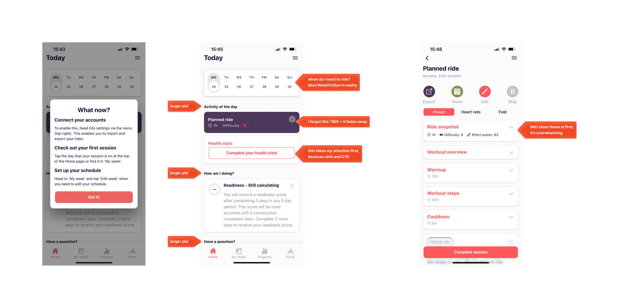
Part of understanding what needs changing, is understanding what's not working. I spent some time assessing what's executed well, and what could be improved and took into account the core SEO goals of trying Spoked, and the B2B proposition.
The landing page hero for example is laid out well, but the buttons could be visually misinterpreted or easily missed over. In addition the navigation didn't share the features—a common page viewed by customers before making a decision.

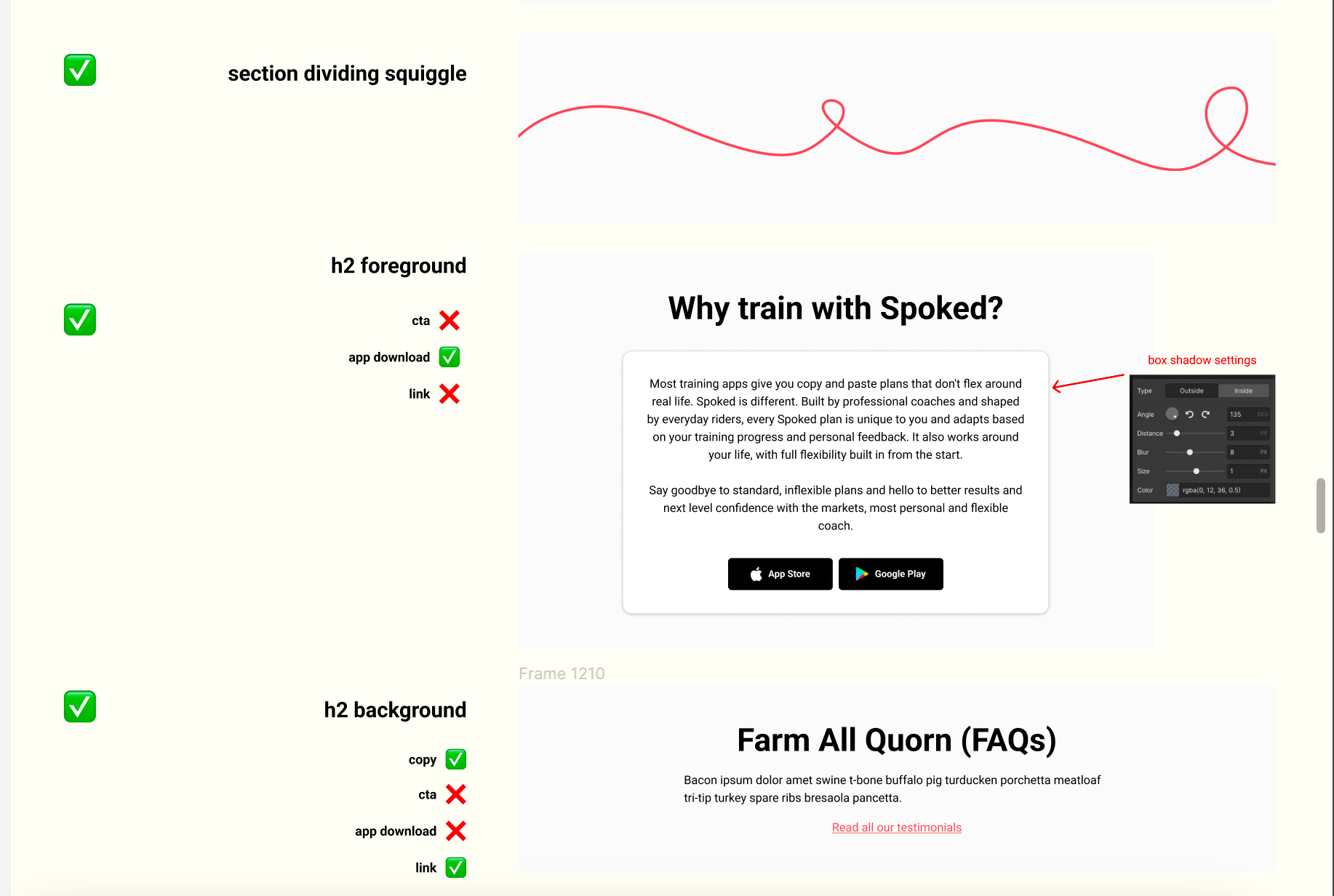
Another example is the "What is Spoked?" page. Here, the primary copy section is center aligned, which makes it difficult to read. In addition, while the use of spacing is great to separate the sections, there's no set foreground and background.
To improve this, using UI elements such as Card UI, and using a darker shade for the background can make the three features below stand out more. We could also use Card UI for only some elements, to set even more of a hierarchy and draw attention to the critical parts.
Orientating myself
This was my first webflow project, and I wanted to get acquainted before tackling the more complex parts of the project. I decided to spend a working day, roughly 8 hours, experimenting and trying to replicate the home page.
Afterwards I learned I needed to strategise and firm up the visuals first, whether hand-drawn wireframes or Figma mockups, then execute. Allowed me to more rapidly explore ideas visually, and freed up my time to learn how to execute within Webflow.
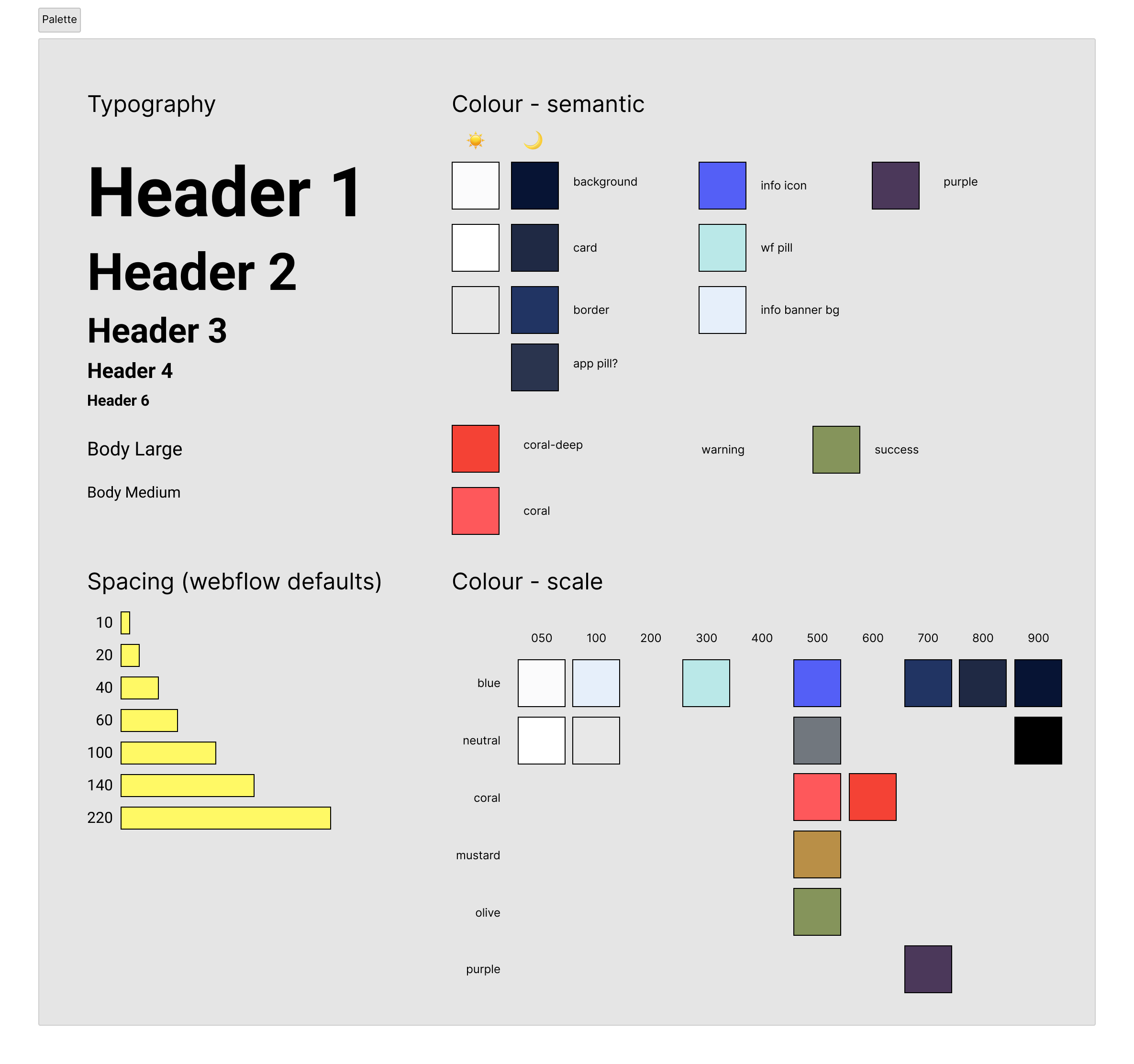
Rebuilding a design palette
From my in-depth experience building an end-to-end design system, I knew I needed at least a basic style palette to work with. I assessed what we had, and assembled the following:
- A basic typographic scale I can semantically marry up with web best practices
- A colour palette I can use to add depth and elevation as necessary
- A spacing scale that's quick to use, and sets a modern visual flow
Adjusting the visual hierarchy
The existing design language was flat, whereas the app had gone more torwards a card-based language. In addition, the goals both Rich and users had could be better catered for in terms of UX.
There's a few techniques I used to improve these:
- The 60/30/10 rule of colour theory—a few subtle tweaks visually brings everything together as a whole.
- Card based UI—it not only aligned to the app, but is also a UI pattern that helps to chunk information, and give the eye more direction of where to travel.
- Introduce elevation from Material Design—not only is it modern, but this helps keep key information for SEO in the background, and bring forward key info we want users to consume and act upon.
- Adjusted the CTAs elements—based on the goal of a page, I swapped the CTA element used. e.g. Buttons have higher prominence than a Link.
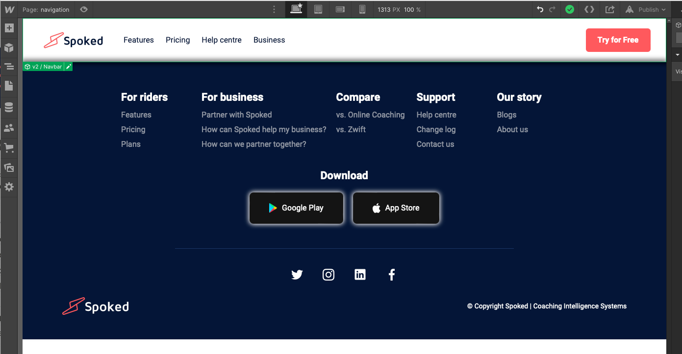
Improving global navigability
Using my past design experience on both Co-operative Bank's website and Smile's banking website, I updated the global navigation to better suit some common tasks users wanted to do. Some goals I aimed to achieve were:
- enable users to navigate backwards or up the site hierarchy
- give full visibility to all sections in the footer
- make the help centre and download app links easier to find
Given the new content strategy was flat, never being more than 2 or 3 levels deep, this made it straightforward.

Delivering the results
A mobile-responsive website
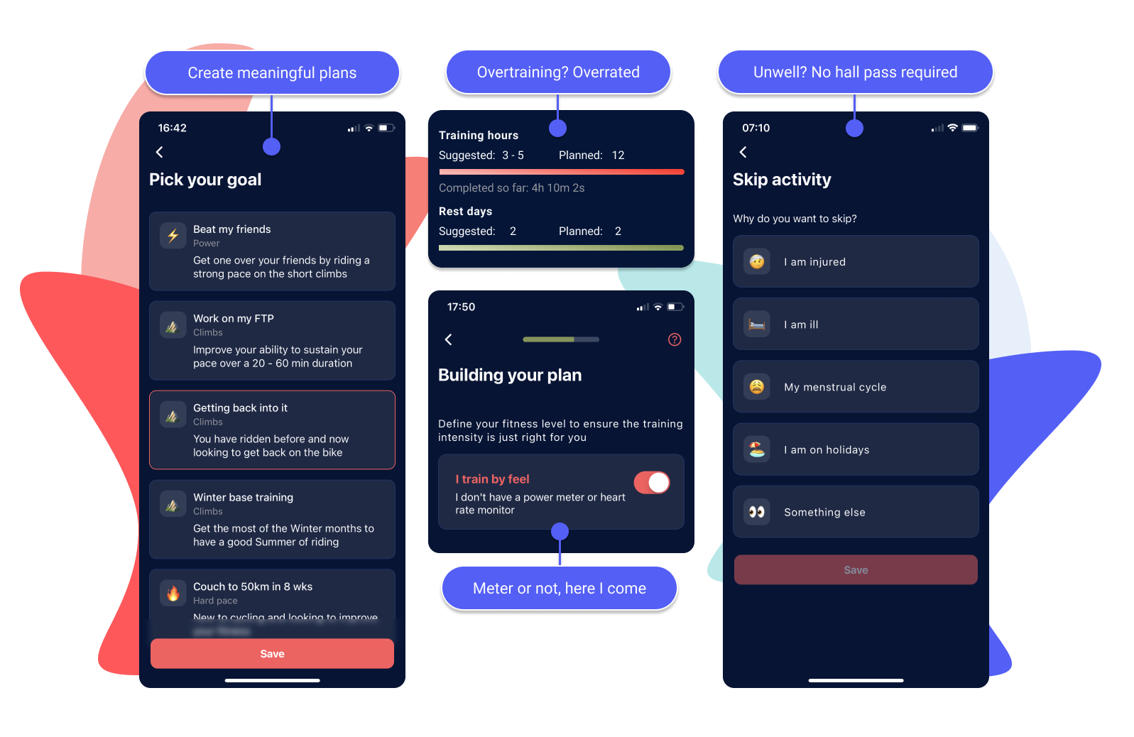
I didn't approach this project mobile-first, but I was keen to keep it mobile responsive. All components were designed to display well on tablet and on mobile.
Documentation
While often overlooked, my goal is always to keep the client in control. Providing just enough documentation means someone can make some changes, without fear of upsetting another part of the site.
What I learned
Webflow classes are shared between components
This adds a layer of complexity you simply don't have in Figma. Edits can accidentally change properties related to a combo class, that's used elsewhere. It's very easy to make a mistake if your concentration slips.
Variants can be achieved by setting display to none
Whilst only some properties can be changed and configured in webflow, you can toggle the visibility of almost anything. Your components will be heavy, but you can add more flexibility by doing this.
It was also the principal I used to make images display responsively—I set up 6 classes respectively:
- desktop-only
- tablet-only
- mobile-only
CMS in Webflow is powerful
Once I gave myself some time to understand the CMS capability, it was really straightforward. Once I set up a collection and the fields I want, I get a template page for free for each CMS item, and I can make my own custom page with a Collection List to display them all.