Leading a 5-designer team to migrate a 200 page website in 4 weeks
The UX team at The Co-operative Bank had a budget of six weeks to influence the migration of the smile.co.uk website, before development began. I volunteered to step up and take on the challenge.
Here's how I did it in just four weeks.
Overview
First an overview of the roles I assumed, the skills I used, and the team I assembled for the job.
Roles
- UX Lead
- Agile Scrum Master
Skills
- Project planning and management
- UI Design, Content Design
- Stakeholder Management
- High fidelity prototyping
- Design Systems
Team
- Product Owner
- Senior UX Researcher
- UX Researcher
- UX Designer
- Content Designer
Problem statement
There were two main drivers for the overall project:
- the existing Content Management System (CMS) required development effort to update
- the existing hosting contract was due to end in 5 months time
In addition, I had two personal goals I wanted to achieve with the project as well:
- apply all the contributions we made to Daly—our Design System—from working on the main Co-operative Bank website
- meet AA WCAG accessibility standards, in-line with the bank's leadership goals
To ensure it went smoothly, I worked with the Product Owner to identify all the key stakeholders, nominate one person to be the "decider" for key decisions, and align everyone to the same direction.
As part of aligning everyone, I did a proposal kickoff session, and shared a Design brief based on all the context
Design brief:
"Migrate Smile content to dotCMS as quickly as possible so we can give back control to Service and Journey over workflows, and leverage the goodness of Daly design patterns."
Preparing the project
There were three main tasks I set myself, to best prepare for the project and set it up for success.
Analysis and information gathering
Talk with our Product Owner, leverage their preliminary analysis, and do some more gathering such as gathering the Adobe Analytics data, any previous work, and assessing what’s possible.
Assemble the team and get input
I held two separate sessions, one with the internal UX team to see if the plan looked reasonable, and fit into our existing workloads. The second session was to replay the plan to the wider stakeholder team to set everyone’s expectations.
Create a design brief and a project plan
A rough finger in the air estimate that can be shared out and refined. Tangibility is important for collaboration, so the focus was put on doing the minimal amount possible to get the maximum return. Using existing design patterns we had previously used, refining the headings, links and call-to-actions, as well an iterative research strategy gave us a solid approach.
Design
Implement Agile methodologies
With such a tight deadline I opted for a 1-week cadence of planning, designing, then delivering. This was to keep communication high and keep stakeholders involved regularly. Putting in the usual ceremonies of daily standup and weekly planning sessions, as well as a Kanban board in Jira facilitated it.
Set up a micro Design System
We had Daly setup with the Co-operative Bank theme, but didn't set it up for Smile. The first week was mostly dedicated to developing a Smile component palette. We design in Figma but only used the free version, which means only styles such as colours and fonts can be shared between files. A single palette with all the components we needed, identified after a round of analysis, would speed up our workflow significantly.
Set a research strategy with a "big bang"

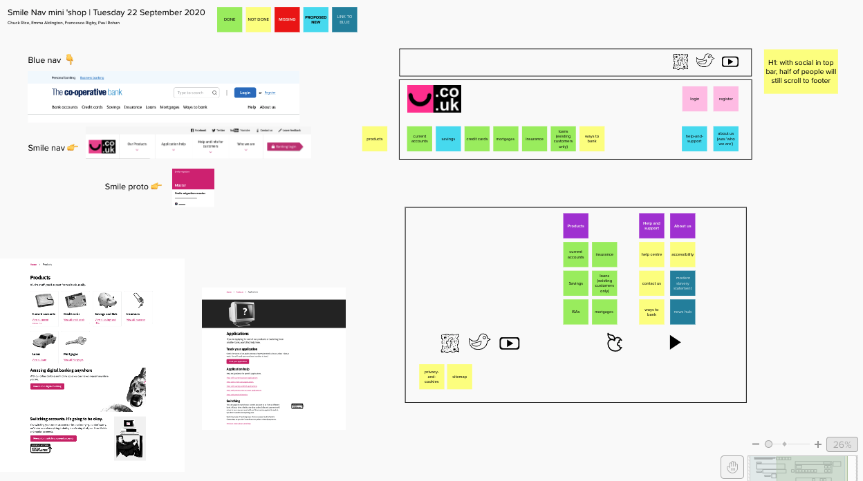
In order to bring all three disciplines of Design, Content and Research, visual digital whiteboards allowed us to making the thinking tangible and allow everyone to interact. It helped to make sense of the new pages we had to create, and rework the information architecture of the global navigation. It gave Content designers the ability to interface their IA skills, and Researchers to feed in their previous insights and refine our research plan.
Assemble the Mega Prototype
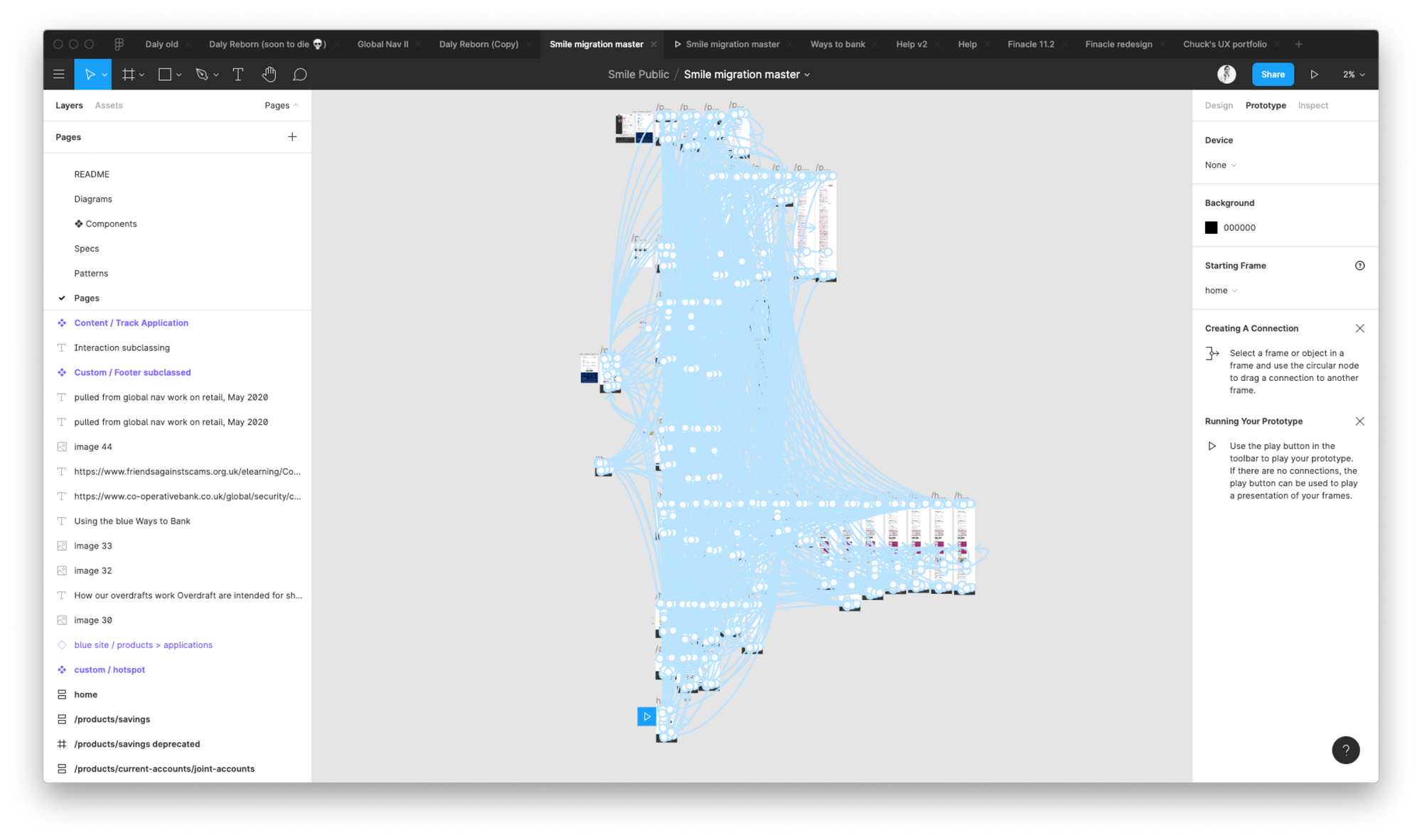
Once the research strategy was in place and the components assembled, it was time to produce prototypes in order to hit the research goals. Alongisde supporting workshops, I divided up and delegated parts of the website to individuals or pairs to work on. I spent my time creating and delivering screens in a collaborative fashion, as well as reviewing the work others had done and highlighting or fixing adjustments needed.

Delivery
Comprehensive handoff documentation
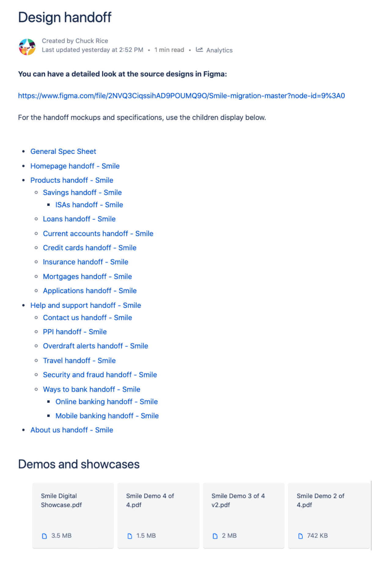
I started a set of pages within Confluence to deliver HD mockups, component structures, link tables and content docs for each page. Why? Bank laptops don’t all have access to Figma, not all stakeholders are from a tech background. Confluence is a neutral ground, and is an audit log of who delivered what and when. Also, our limitation of free Figma means files often are tied to individuals and are at risk of becoming lost.

Regular stakeholder demo sessions
Demo sessions give us a way to showcase our progress, open up the floor to questions and critique to adjust our direction of travel, and serve as a paper trail audit of our work. In the past the bank has had design work questioned, and with a paper trail no more extensive than a Figma file we sometimes struggled to justify decisions or supply adequate rationale. Together with a backlog we now have a solid paper trail of evidence.
Outcomes
- Delivered 33% faster than anticipated
- 17.5% of all pages redesigned
- Nominated for 'Digital Spotlight' showcase to senior management
After handoff to the development team, a grand total of 3 build issues were identified when scoping the build tickets and sprints.
All were trivial fixes.

Challenges
Transitioning from the previous project
Since the team and the wider bank were not all yet versed in Lean UX and Agile methodologies, the project started 2 weeks later than planned. This is fine in Agile methods, and we simply prioritise our work. As part of the first week splitting up the site, we could get a good sense of what was achievable and the weekly demo and planning sessions, as well as stand ups, enabled us to keep a pulse on our progress.
Working with a young Design System
Our design system, Daly, is still truly in its infancy and has been restructured twice in my time here already. It needs a lot more work to be organised, comprehensive, and documented for non-design teams. Combined with only having access to the free version of Figma proved challenging. Budgeting more time to prepare a Component palette to work from, as well as documenting the delivered work in Confluence, helped to combat these limitations.
